How to create a three-line menu icon that toggles a mobile navigation menu
In this article, you're going to learn how to create a three-line menu icon (the hamburger icon) that toggles a mobile navigation menu every time you tap on it.
See a demo and download the source code
If you want to see now the end result of this article, please click on see a demo. Likewise, if you want to download the source code, please click on download the source code to go to my Github page.
Getting started
1. Begin a new HTML5 document in your text editor or IDE to be named index.html and link the CSS files responsible for applying primary styles to the HTML elements and the layout of your site (boilerplate.css and style.css).
2. Likewise, include all the JavaScript stuff in order for versions of Internet Explorer prior to version 9 to support HTML5 elements and Media Queries (HTML5Shiv and Respond.js).
<!doctype html>
<!--[if lt IE 7]> <html lang="en" class="ie6 oldie"> <![endif]-->
<!--[if IE 7]>    <html lang="en" class="ie7 oldie"> <![endif]-->
<!--[if IE 8]>    <html lang="en" class="ie8 oldie"> <![endif]-->
<!--[if gt IE 8]><!--> <html lang="en" class="">
<!--<![endif]-->
<head>
<meta charset="utf-8">
<meta name="viewport" content="width=device-width, initial-scale=1">
<title>Mobile Navigation Menu</title>
<link href="boilerplate.css" rel="stylesheet" type="text/css">
<link href="style.css" rel="stylesheet" type="text/css">
<!--
To learn more about the conditional comments around the html tags at the top of the file:
paulirish.com/2008/conditional-stylesheets-vs-css-hacks-answer-neither/

Do the following if you're using your customized build of modernizr (http://www.modernizr.com/):
* insert the link to your js here
* remove the link below to the html5shiv
* add the "no-js" class to the html tags at the top
* you can also remove the link to respond.min.js if you included the MQ Polyfill in your modernizr build
-->
<!--[if lt IE 9]>
<script src="http://html5shiv.googlecode.com/svn/trunk/html5.js"></script>
<script src="respond.min.js"></script>
<![endif]-->
</head>
<body>
</body>
</html>
The top header
1. Once all those files are in place, start creating the top header that will hold the Company name and the three-line menu icon.
<body>
  <header class="top-header">
    <h1>Company Name</h1>
    <div class="hamburger-icon">
      <label for="checkbox-menu"></label>
    </div>
  </header>
</body>
</html>
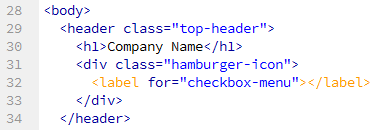
2. As you can see, the top header is made up of four HTML elements. The header tag is one of the new semantic elements for structuring a page in HTML5. It represents the header of a document or section of a document. It's perfect to contain the h1 tag for the company name and the div tag for the hamburger icon. You'll soon see why the div element contains a label for a checkbox input tag.
3. The header tag has the top-header class applied to it. This is what the CSS code looks like:
.top-header {
  background-color: rgb(128, 0, 128);
  color: rgb(255,255,255);
  height: 3em;
  left: 0;
  margin-bottom: 1.25em;
  position: fixed;
  right: 0;
  top: 0;
  z-index: 10;
}
First, the top-header class uses EMS to set the height of the top header. What does EMS mean? What is it used for? EMS is a relative unit measurement that works exactly the same as percentages (a percentage value is just an em multiply by 100). It is used for expressing a length in relationship to the font size defined by the browser. In most browsers, the base font size is set to 16 pixels. You can adjust this setting in the preferences of your browser, but whatever the base font size you set, it always will be equivalent to 100%. In other words, if the base font size is set to 16 pixels and you set, for example, the height of a particular element to 3em or 300%, then that element will be 48 pixels height.
The font size is an inherited property, which means that any tag inside a tag with a font size specified inherits that font size. So, the base font size of 100% can change if a particular tag inherits a font size that is not equal to 16px, 100%, or 1em.
Second, the position:fixed declaration makes the header fixed; the left:0, right:0, and top:0 declarations place it at the top of the page taking up the whole viewport (the width of the browser window); and z-index:10 puts it above the other content.
The hamburger icon
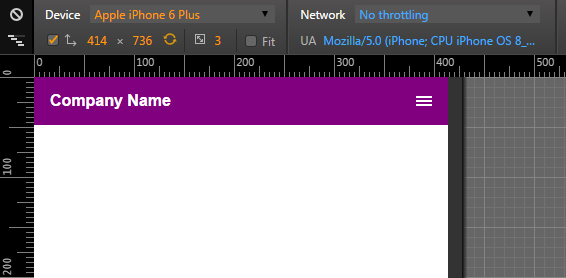
Let's carry on with the three-line menu icon that will toggle the mobile navigation menu every time visitors to the web tap on it. This is what the CSS code looks like:
.hamburger-icon {
  margin-left: 3m;
  position: relative;
}

.hamburger-icon label:before {
  border-bottom: 0.125em solid white;
  border-top: 0.375em double white;
  bottom: 1.1875em;
  content: "";
  height: 0.125em;
  position: absolute;
  right: 1em;
  width: 1em;
}
And this is how it looks when previewing the file in the browser:
As you can see, the div element with the hamburger-icon class has been relatively positioned. A relatively positioned element is placed relative to its current position in the HTML flow. However, the main benefit of relative positioning in this example is to set a new point of reference for its absolutely positioned child elements. That's why the .hamburger-icon label:before selector has got a position:absolute declaration.
The input tag's checked attribute is assigned a value of checked every time you click on its label. This allows you to use a selector like #checkbox-menu:checked + nav for showing the mobile navigation menu without using a bit of JavaScript code!
How does the .hamburger-icon label:before selector work? In CSS, the :before pseudo-element allows you to add content before (preceding) a given element. This content is generated by the web browser on the fly, meaning that it doesn't exist in the HTML code. If you leave empty the label for the hamburger icon and use this powerful pseudo-element, you'll be able to create a three-line menu icon without using an image. Just assign an empty string to its content property and use the border-bottom, border-top, and height properties to draw the three lines!
The mobile navigation menu
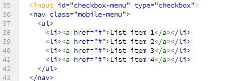
Now that the top header is done, let's tackle the navigation menu. This is what its HTML looks like:
...
</header>
<input id="checkbox-menu" type="checkbox">
<nav class="mobile-menu">
  <ul>
    <li><a href="#">List item 1</a></li>
    <li><a href="#">List item 2</a></li>
    <li><a href="#">List item 3</a></li>
    <li><a href="#">List item 4</a></li>
  </ul>
</nav>
Now the CSS code:
#checkbox-menu {
  display: none;
}

#checkbox-menu:checked + nav {
  opacity: 1;
  visibility: visible;
}

nav.mobile-menu {
  background-color: black;
  height: auto;
  left: 0;
  right: 0;
  opacity: 0;
  position: fixed;
  top: 3em;
  visibility: hidden;
  z-index: 5;
}

nav.mobile-menu ul li {
  border-bottom: 1px solid lightgray;
  font-size: 0.875em;
  height: 2.285714285714286em;
  line-height: 2.285714285714286em;
  padding-left: 1.142857142857143em;
}

nav.mobile-menu ul li a {
  color: lightgray;
  text-decoration: none;
}

nav.mobile-menu ul li a:hover {
  color: white;
}
As you can see, the CSS code for the mobile navigation menu is pretty much the same as the one for the top header There are just two new properties here. While the height:auto declaration lets the navigation menu become higher as list items are added to it, the opacity:0 declaration hides it until the visitor tap the three-line menu icon. This behaviour is handled by the #checkbox-menu:checked + nav selector, which, as said above, shows/hides the navigation menu every time visitors to the page tap the hamburger icon. It selects a single nav tag that immediately follows an element with an ID of checkbox-menu (the input tag) as long as its state is checked, and then sets the opacity property to a value of 1.
Finally, because you want the navigation menu to fade into view (and to fade out of view), let's use the CSS3 transition property to get that effect:
nav.mobile-menu {
  background-color: black;
  height: auto;
  left: 0;
  right: 0;
  opacity: 0;
  position: fixed;
  transition: all .75s ease-in;
  top: 3em;
  visibility: visible;
  z-index: 5;
}
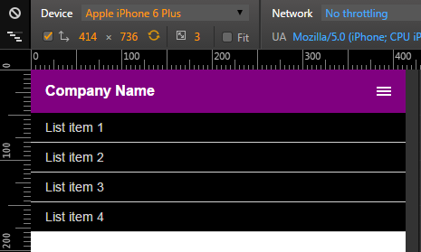
This is how the navigation menu looks when you tap the three-line menu icon: