Flexbox explained (3)

This is the third and last article of the Flexbox Explained series. In this article, you will learn about the properties (flex-wrap, align-content, and order) that allow you to control the flow of flex items, that is, the way they are laid out, aligned and ordered.
What are flex lines?
First, it is of primary importance that you understand what flex lines are. Flex items are laid out and aligned within flex lines.
In the first article of this series, you can read that “Flex lines are filled with items and placed into the container starting on the cross start side and going towards the cross end side.”
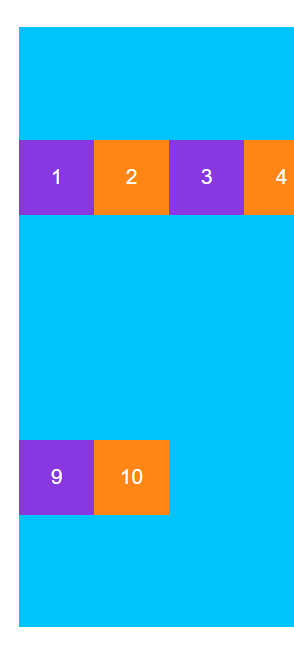
This is because a flex container can be single line or multi line depending on the value the flex-wrap property is given. By default, a flex container is single line, like the one shown in the following image:
The flex items in the previous image did not shrink because they are 50px width each and their parent container is 400px width. If you add more flex items, they will be shrunk in order to fit the whole width of their parent container.
While a single line flex container (one with flex-wrap:nowrap) lays out all its flex items in a single line no matter whether they overflow or not, a multi line flex container (one with flex-wrap:wrap or flex-wrap:wrap-reverse) breaks them across multiple lines.
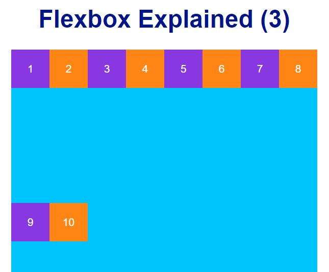
The previous image shows a two-line flex container. Since the used space is greater than the width of the parent container, Flexbox lays out the last two flex items in a new line located in the middle of the container.
Remember that flex-wrap is a property of the parent container.
The flex-flow shorthand
The flex-flow property is a shorthand for the flex-direction and flex-wrap properties. If you want to set both properties in a row, then use the flex-flow shorthand property as follows: (e.g.: flex-flow: row wrap).
The align-content property
In the previous image, you can see that Flexbox lays out the last two flex items in the middle of the multi line flex container. That is the default behaviour of the flex-wrap property when you work with a two-line flex container.
In order to modify the default behaviour of the flex-wrap property, you can use the align-content property, which, as you can read in the second article of this series, aligns flex lines instead of flex items. This property overrides the align-items property right after it is set with a value different to stretch.
align-content takes the same values as the align-items property.
For example, the following image shows how flex items are laid out when their parent container is set to be multi line (in this case, a two-line flex container) by using the property:value pair flex-wrap:wrap. In addition, the align-items property has been also set with a value of center.
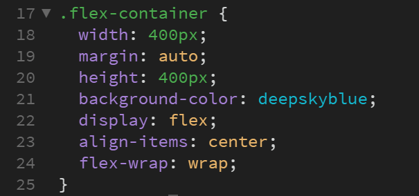
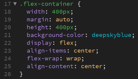
This is the code for the flex-container class:
.flex-container {
  width: 400px;
  margin: auto;
  height: 400px;
  background-color: deepskyblue;
  display: flex;
  align-items: center;
  flex-wrap: wrap;
}
Now, what will happen if the align-content property is set with a value different to stretch? For example, let’s set the align-content property with a value of center.
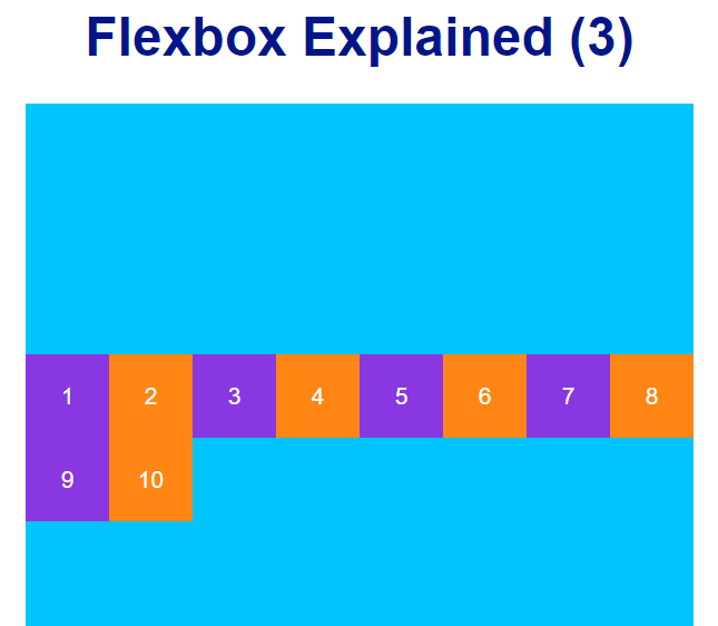
As you can see in the previous image, now the two lines of flex items are laid out in the middle of the flex container, overriding the preceding layout created by the align-items property.
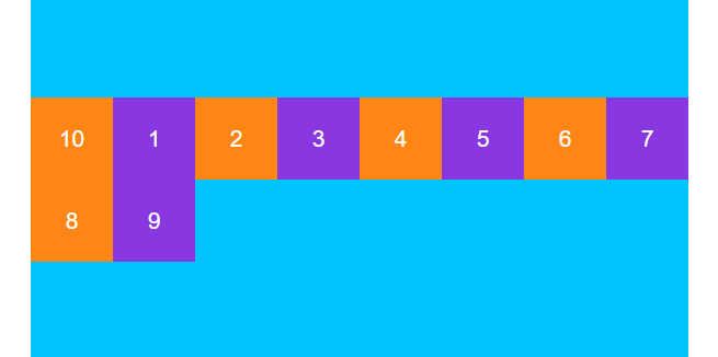
The order property
The order property specifies the order of a flex item relative to the rest of the flex items inside the same flex container, being 0 the default value.
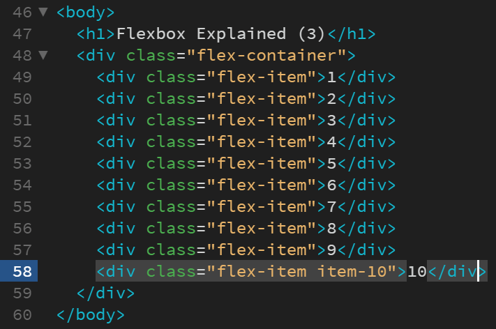
A change in the order of a flex item entails no changes in the HTML code.
So if you wanted to change the order of the tenth box in the previous example to be the first box in the row, you would have to give its order property a value lesser than zero, since, as said above, all flex items have a default value of 0.