Flexbox explained (2)

In the first article of this series, you learned that the parent container has the ability to alter the size of its child elements (flex items). This means that, even though you set a specific size for them in the CSS code, Flexbox could make them larger, smaller, or do nothing and leave them as they are.
How is the cross size of flex items rendered by the web browser?
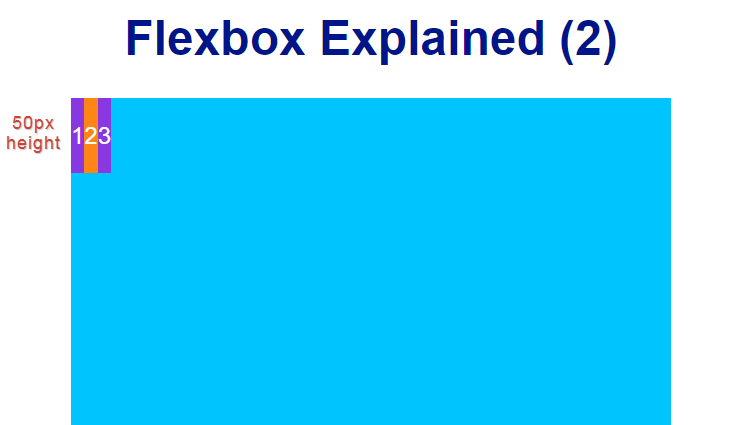
In order to understand how the cross size is rendered, let’s start with a piece of code in which the flex items height (cross size) is set in the CSS code.
The following screenshots have been taken with the flex-direction property set to row, which is the value by default. That is, the main axis is horizontal.
<!doctype html>
<html lang="en">
<head>
<meta charset="utf-8">
<meta name="viewport" content="width=device-width, user-scalable=no, initial-scale=1.0, maximum-scale=1.0, minimum-scale=1.0">
<title>Flexbox Explained (2)</title>
<style>
body {
  padding: 0;
  margin: 0;
  font-family: Arial, sans-serif;
}
h1 {
  color: darkblue;
  text-align: center;
}
.flex-container {
  width: 400px;
  margin: auto;
  height: 400px;
  background-color: deepskyblue;
  display: flex;
}
.flex-item {
  background-color: blueviolet;
  color: white;
  display: flex;
  align-items: center;
  justify-content: center;
  height: 50px;

}
.flex-item:nth-child(even) {
  background-color: darkorange;
}
</style>
</head>

<body>
  <h1>Flexbox Explained (2)</h1>
  <div class="flex-container">
    <div class="flex-item">1</div>
    <div class="flex-item">2</div>
    <div class="flex-item">3</div>
  </div>
</body>
</html>
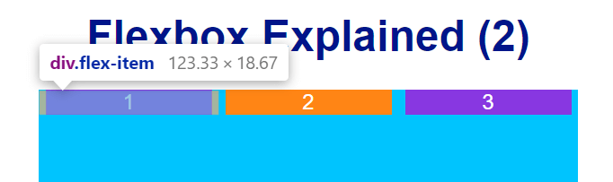
If a specific height (cross size) is set in the CSS code for a flex item or a group of flex items, then they will be rendered with the height set in the CSS code, like this:
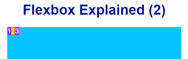
If a specific height (cross size) is not set and the align-items or align-content property is not set either, the height of flex items will fit the whole height of their container, like this:

The align-content property modifies the behaviour of the flex-wrap property. It is similar to align-items, but instead of aligning flex items, it aligns flex lines. You will learn how the flex-wrap property works later on in this series.
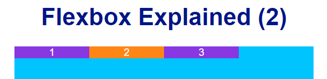
If a specific height (cross size) is not set and the align-items or align-content property is set and it is different to stretch, the height (cross size) of flex items will fit the height of their own content, like this:
In the previous image, the align-items property has been given a value of flex-start.
How is the main size of flex items rendered by the web browser?
In order to understand how the main size of flex items is rendered, first you have to know what the terms Used Space, Unused Space, and Positive Used Space/Negative Used Space mean? Let’s analyze, then, the following image:
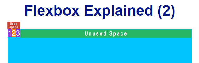
- Used Space is the space taken by all flexible items.
- Unused Space is the space that is not taken by any flexible items.
- If Used Space is smaller than the size of the parent container, then it is called Positive Used Space.
- If Used Space is greater than the size of the parent container, then it is called Negative Used Space.
In addition, flex boxes margins are never stretched or shrunk and they are taken into account when calculating the space used by flex items, as shown in the following image:
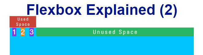
The flex items in the previous image have been assigned a margin property with a value of 0 5px.
Now, if you make the flex items of the previous image wider (e.g., 200px), you will realize that they fit the whole width of their parent container even though it is only 400 pixels width (Flexbox adjusts their main size so that there is no overflow).
As you can see in the previous image, all three flex items are 123 pixels width (they have been shrunk) even though a greater value was set for each of them. Why? Let’s find it out by learning the properties that allow you to calculate the main size of flex items: flex-basis, flex-grow, and flex-shrink.
The flex-basis property sets the basis (initial) length of a flex item. As you just saw, the value given to this property can grow, shrink or remain the same.
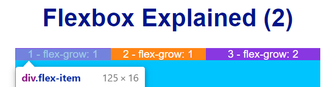
The flex-grow property sets the flex grow factor, which determines how much the flex item will grow relative to the rest of the flex items in the same flex container when positive used space is distributed. Let’s have a look at the following image to understand how it works.
As you can see, the previous image shows a flex container of 400 pixels width and three flex items of 100 pixels width each inside. What will happen if the first and second flex item is given a value of 1 as its flex grow factor and the third flexible item is given a value of 2?
The following screenshots have been taken with the flex-direction property set to row, which is the value by default. That is, the main axis is horizontal.
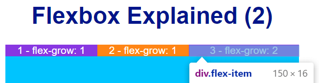
In order to determine the main size of the previous flex items, the web browser will do the following mathematical calculation:
Unused Space: 100 pixels
Sum of flex grow factor: 1 + 1 + 2 = 4
100 / 4 = 25
The Unused Space in the flexible container (100 pixels) is divided by 4 and then distributed accordingly.
As you might expect, the first and second flex item will grow 25 pixels and the third flex item will do the same thing and will be 50 pixels width. This is because the latter has a value of 2 as its flex grow factor (25 x 2 = 50).
The flex-shrink property sets the flex shrink factor, which determines how much the flex item will shrink relative to the rest of the flex items in the same flex container when negative used space is distributed.
If you analyze the following image:
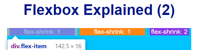
you will realize that flex items, which are taken 200 pixels width plus 10 pixels of margin-left and margin-right each, are shrunk because the sum of their main size is greater than the width of the parent container. When negative used space is distributed, Flexbox will do the following mathematical calculation:
Used Space: 400 px - 630 px = -230 px
Sum of flex shrink factor: 1 + 1 + 2 = 4
-230 / 4 = -57.5
The Used Space, which is negative in this case (-230 px), is divided by 4 and then distributed accordingly.
As you might expect, the first and second flex item will shrink 57.5 pixels and the third flex item will do the same thing and will be 85 pixels width. This is because the latter has a value of 2 as its flex shrink factor (-57.5 x 2 = -115; 200 - 115 = 85).
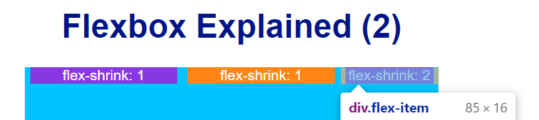
By default, all flex items have a value of 1 as their flex shrink factor. That’s why the flex items in the sixth image of this article are 123 pixels width.
Shorthand for flex-grow, flex-shrink, and flex-basis
The flex-grow, flex-shrink, and flex-basis properties can be set in a row by using the flex shorthand. The flex property is set initially as follows:
flex: 0 1 auto
which means that:
- Flex items cannot grow.
- Flex items can shrink.
- Their flex-basis property is initially set with a value of auto.
In addition to the value set by default for the flex shorthand, there are three more values that can come in handy:
flex: none = flex: 0 0 auto
which means that:
- Flex items cannot grow.
- Flex items cannot shrink.
- Their flex-basis property is initially set with a value of auto.
flex: auto = flex: 1 1 auto
which means that:
- Flex items can grow.
- Flex items can shrink.
- Their flex-basis property is initially set with a value of auto.
flex: N = flex: N 0 0 where N is an integer
which means that:
- Flex items will grow as much as N
- Flex items cannot shrink.
- Their flex-basis property is initially set with a value of 0.
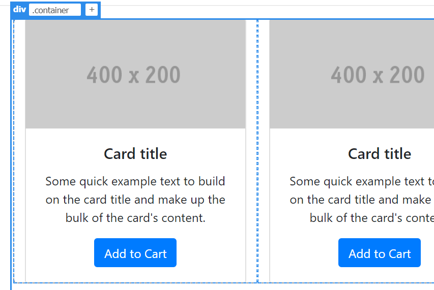
Case Study - Bootstrap e-commerce Page Template
Now that you already know how the main size of flex elements is calculated, let’s have a look at how Bootstrap uses the properties you have learned to layout a grid for an e-commerce page.
See the Pen Bootstrap e-commerce page template by Jesus (@jeshr) on CodePen.
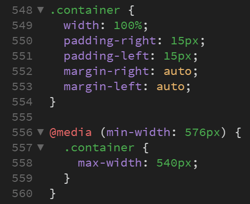
1. Bootstrap (version 4.4.1) uses a div element with the container class to contain the product cards. This container becomes wider as long as you stretch the window of your web browser.
By default, it is assigned the following properties:
.container {
  width: 100%;
  padding-right: 15px;
  padding-left: 15px;
  margin-right: auto;
  margin-left: auto;
}
And a new property:value pair (max-width:value) will be added every time you change to a viewport that falls into the media queries Bootstrap usually works with. For example, if you change to a viewport with a minimum width of 576 pixels, then the max-width: 540px pair will be added to the container class. If you change again to another viewport (e.g., a wider one with a minimum width of 768 pixels), then the max-width: 720px pair will be added to the container class overriding the previous one and so on.
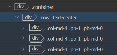
2. Inside the container, there is a div element with the row class. This is the flex container, that is, the container that is assigned the display:flex pair in order for Bootstrap to be able to work with Flexbox.
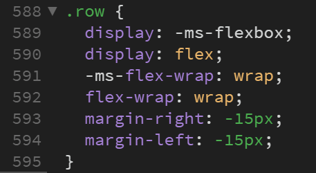
Apart from the display:flex pair, the row class is assigned the flex-wrap property with a value of wrap. Even though you will learn how this property works later on in this series, I am going to tell you in advance that it specifies whether the flex items should wrap or not. In this particular case, they are set to wrap
As you can see in the previous image, there are two properties, margin-right and margin-left, with a value of -15px. These properties are added to the row class to neutralize the padding-right and padding-left properties of its parent container.
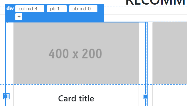
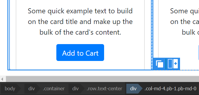
3. Inside the div element with the row class, there are three div elements (flex items) with the col-md-4 class.
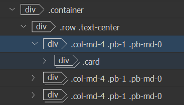
This class is defined outside all media queries and then extended under (min-width: 768px). The following image shows the class definition outside all media queries:
.col-1, .col-2, .col-3, .col-4, .col-5,
.col-6, .col-7, .col-8, .col-9, .col-10,
.col-11, .col-12, .col, .col-auto, .col-sm-1,
.col-sm-2, .col-sm-3, .col-sm-4, .col-sm-5, .col-sm-6,
.col-sm-7, .col-sm-8, .col-sm-9, .col-sm-10, .col-sm-11,
.col-sm-12, .col-sm, .col-sm-auto, .col-md-1, .col-md-2,
.col-md-3, .col-md-4, .col-md-5, .col-md-6, .col-md-7,
.col-md-8, .col-md-9, .col-md-10, .col-md-11, .col-md-12,
.col-md, .col-md-auto, .col-lg-1, .col-lg-2, .col-lg-3,
.col-lg-4, .col-lg-5, .col-lg-6, .col-lg-7, .col-lg-8,
.col-lg-9, .col-lg-10, .col-lg-11, .col-lg-12, .col-lg,
.col-lg-auto, .col-xl-1, .col-xl-2, .col-xl-3, .col-xl-4,
.col-xl-5, .col-xl-6, .col-xl-7, .col-xl-8, .col-xl-9,
.col-xl-10, .col-xl-11, .col-xl-12, .col-xl, .col-xl-auto {
  position: relative;
  width: 100%;
  padding-right: 15px;
  padding-left: 15px;
}
And this is the same class defined under (min-width: 768px).
.col-md-4 {
  -ms-flex: 0 0 33.333333%;
  flex: 0 0 33.333333%;
  max-width: 33.333333%;
}
As you can see, the flex property is given a value of 0 0 33.333333%, which means that:
- Flex items cannot grow.
- Flex items cannot shrink.
- Their flex-basis property is set with a value of 33.333333%.
And that’s why there are three product cards in a single line. If you add another product card, the fourth one will fall below the first product card since flex items cannot grow or shrink and they have been set to wrap.
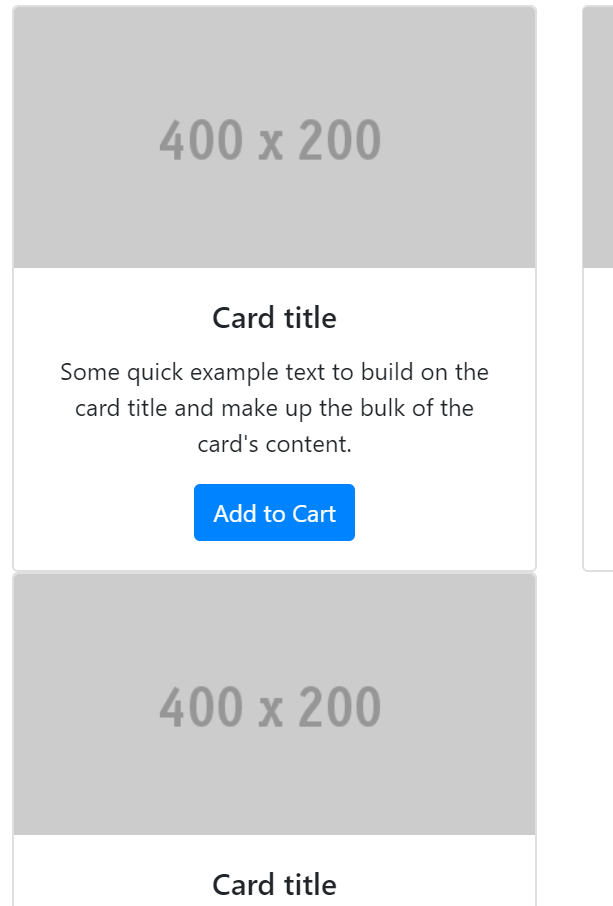
col-md-4 means that from medium to extra large viewports, each product card will take four columns (33.333333%) out of the twelve columns available to be used.