Bootstrap Theming - Responsive Slideshow in Drupal 7 with Flexslider (Part 3/3)

In this part, I'm going to finish the responsive slideshow in Drupal 7.
The goal
Now that you have a Flexslider block, let's go through the steps to finish it and give it some styles.
Download the CSS code
Please, click here to download the CSS code you will be working with.
Making the image field look good
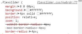
1. As you can see in the figure at the end of the second part of this article, there is a little white space at each side of the images. Override the flexslider class’ border property to get rid of it.
.flexslider {
  border: none;
}
2. Place the images right after the navigation bar.
.view-recipe-slideshow {
  margin-top: -20px;
}
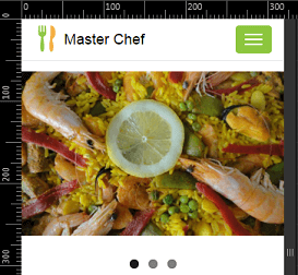
3. As you can see in the previous figure, the paging controls are located below the images. Move them up so that they are located at the bottom of the images. In addition, change their background color from black to orange.
.flex-control-nav {
  bottom: 10px;
}

.flex-control-paging li a.flex-active {
  background-color: rgb(250,165,0); /* Orange */
}
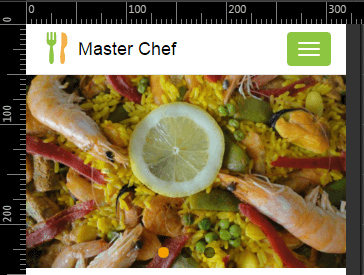
4. Darken a bit the images of the slider.
.flexslider {
  background: #000000; /* black */
  border: none;
}

.flexslider .slides li {
  -webkit-backface-visibility: visible;
}

.flexslider .slides img {
   opacity: 0.8;
}
5. Set the height of the slider for small devices on portrait mode (e.g., an Ipad, a Google Nexus 10...).
@media only screen and (min-width: 768px) and (orientation: portrait) {
  .flexslider {
    height: 480px;
    overflow: hidden;
  }
}
6. Set the height of the slider for medium and large devices.
@media only screen and (min-width: 768px) {
  ...
  .flexslider {
    height: 535px;
    overflow: hidden;
  }
}
7. Remove the navigation bar's bottom border for small, medium, and large devices when the visitor is on the front page.
@media only screen and (min-width: 768px) {
  ...
  .front .navbar {
    border: none;
  }
}
8. Finally, set the height of the slider for small devices on landscape mode. I'm going to use the whole height of the browser window.
@media only screen and (max-width: 767px) and (orientation: landscape) {
  .view-recipe-slideshow {
    margin-top: -64px;
  }

  .flexslider {
    height: 100vh;
    overflow: hidden;
  }
}

@media only screen and (max-width: 480px) and (orientation: landscape) {
  .view-recipe-slideshow {
    margin-top: -44px;
  }

  .flexslider {
    height: 300px;
  }
}
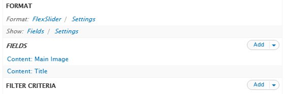
Adding the title field to your view
1. Go back to the Recipe Slideshow view and add the title field to it.
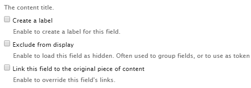
2. Click the Content: Title link and then uncheck the Link this field to the original piece of content checkbox.
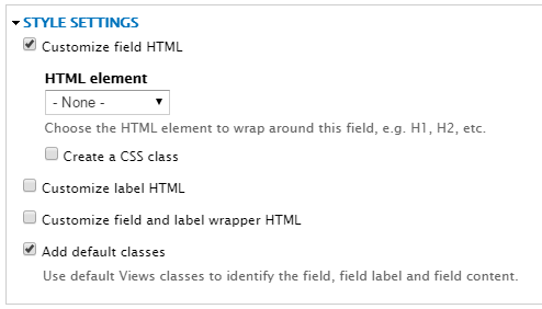
3. Check the Customize field HTML checkbox and select none from the HTML element drop-down menu.
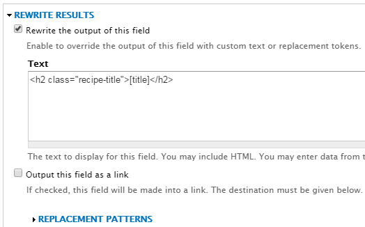
4. In the Rewrite Results section, check the Rewrite the output of this field checkbox and then copy the following code into the Text textarea.
<h2> class="recipe-title">[title]</h2>
I have used a replacement pattern for the title of the recipe. Click the Replacement Patterns link to see all the replacement patterns available to you.
5. Apply all changes and save your view
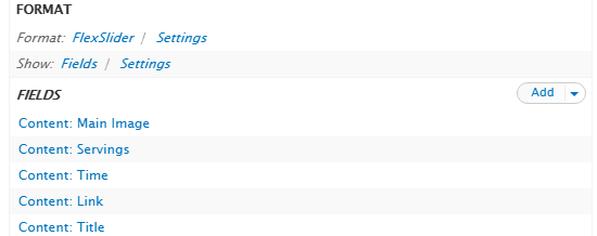
Adding the Servings, Time, and Link fields to your view
1. Add the servings field to the view you are working with (Recipe Slideshow).
2. Click the Content: Servings link and then do the following:
- Uncheck the Create a label checkbox
- Check the Exclude from display checkbox
3. Ignore the other options, apply all changes, and save your view.
4. Repeat steps 1 through 3 for the time and link fields.
Note that the Display prefix and suffix checkbox must be unchecked for the Servings and Time fields.
When adding the link field, don't forget to provide the text to be displayed in the Text to display textbox.
5. Rearrange the fields so that the Title field is the last item in the list.
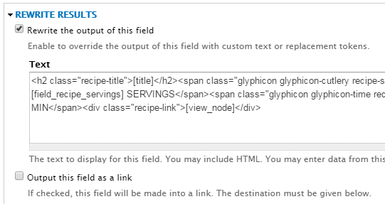
6. Click on the Title link again, and then paste the following piece of code into the textarea that falls under the Rewrite Results section:
<h2 class="recipe-title">[title]</h2><span class="glyphicon glyphicon-cutlery recipe-servings" aria-hidden="true"></span><span class="recipe-servings-value"> [field_recipe_servings] SERVINGS</span><span class="glyphicon glyphicon-time recipe-time" aria-hidden="true"></span><span class="recipe-time-value"> [field_recipe_time] MIN</span><div class="recipe-link">[view_node]</div>
7. Apply all changes and save your view.
Making the title field look good
1. Position the title for extra small devices and give it some format.
.view-recipe-slideshow .views-field-title {
  color: white;
  font-weight: bold;
  position: absolute;
  text-align: left;
  text-shadow: 1px 1px 1px black;
  top: 20%;
  width: 88vw;
}

.view-recipe-slideshow .recipe-title {
  font-size: 20px;
  margin-bottom: 10px;
  margin-left: 12%;
  margin-top: 0;
}
2. Set the font-size property to a value of 24px for extra small devices on landscape mode. In addition, set the top and width properties to a value of 35% and 76vw, respectively.
@media only screen and (max-width: 767px) and (orientation: landscape) {
  ...
  .view-recipe-slideshow .views-field-title {
    top: 35%;
    width: 76vw;
  }

  .view-recipe-slideshow .recipe-title {
    font-size: 24px;
  }
}
3. Set the font-size property to a value of 28px for small devices. In addition, set the top and width properties to a value of 35% and 50vw, respectively.
@media only screen and (min-width: 768px) {
  ...
  .view-recipe-slideshow .views-field-title {
    top: 35%;
    width: 50vw;
  }

  .view-recipe-slideshow .recipe-title {
    font-size: 28px;
  }
}
4. Set the font-size property to a value of 32px for medium devices.
@media only screen and (min-width: 992px) {
  .view-recipe-slideshow .recipe-title {
    font-size: 32px;
  }
}
5. Set the font-size property to a value of 36px for large devices. In addition, set the top, width, and margin-left properties to a value of 25%, 50vw, and 24%, respectively.
@media only screen and (min-width: 1200px) {
  .view-recipe-slideshow .views-field-title {
    top: 25%;
    width: 50vw;
  }

  .view-recipe-slideshow .recipe-title {
    font-size: 36px;
  }

  .view-recipe-slideshow .recipe-title {
    margin-left: 24%;
  }
}
6. Set the top property to a value of 20% for extra large devices. In addition, set the margin-left property to a value of 25%.
@media only screen and (min-width: 1600px) {
  .view-recipe-slideshow .views-field-title {
    top: 20%;
  }

  .view-recipe-slideshow .recipe-title,
    margin-left: 48%;
  }
}
Making the Servings, Time, and Link fields look good
In order to avoid making this article too long, I’m not going to comment the CSS code for the servings, time, and link fields. Don’t worry, you can download it by clicking here.
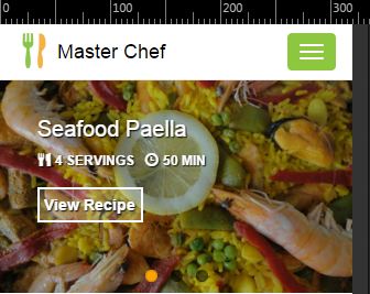
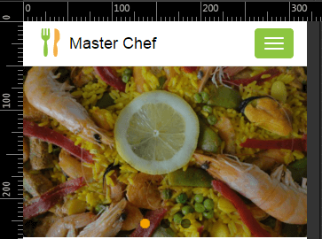
Finally, if everything is OK, this is how the slideshow should look:
Although the responsive slideshow is finished, if you look carefully at its HTML code, you will realize that there is enough room for improvement, specially as to semantic tags. In the next article of this series, you will learn how to customize this code in order to get a more polished finish.