Bootstrap Theming - Responsive Navigation Menu in Drupal 7 (Part 1/2)

In this article, I'm going to show you how to create a sticky (fixed to top), fluid, and responsive navigation menu with Bootstrap in Drupal 7.
The Goal
One of your clients is a chef who owns a website powered by Drupal 7. Since it is very old-fashioned, he asks you for a new and modern design so that his site is suitable for all types of devices. In this article, I'm going to cover just how to create the navigation menu for small and extra-small screens.
Watch the end result
Please, click here to open a modal window with a video showing the end result of this article.
Requirements
In order to achieve the goal, I’m going to use the following modules/themes in addition to the ones that are part of the core:
- Bootstrap
- jQuery Update
In addition, since the Bootstrap theme uses HTML5, you must replace the default doctype declaration (XHTML + RDFa is the default doctype declaration used by Drupal 7).
Learn how to install Bootstrap and how to create an HTML5 DTD here.
Getting Started with the Logo
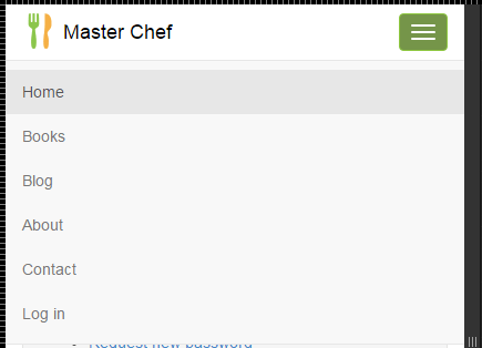
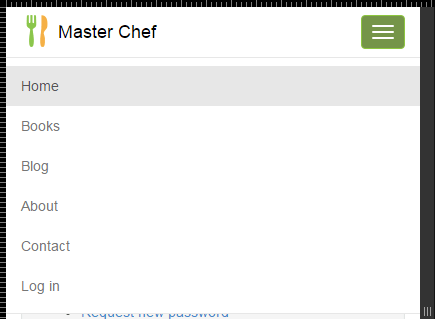
Once you are done with all the previous requirements, this is how the navigation menu looks for extra-small and small screens:
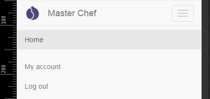
And this how it looks for medium and large screens:

While the Home link is part of Drupal’s Main Menu, My account and Log out fall down under the User Menu. You will add new links to these menus later in this article.
Both Main Menu ($main_menu) and User Menu ($secondary_menu) are examples of hard-coded variables. They are printed in page.tpl.php.
With that said, let’s start by replacing the logo:
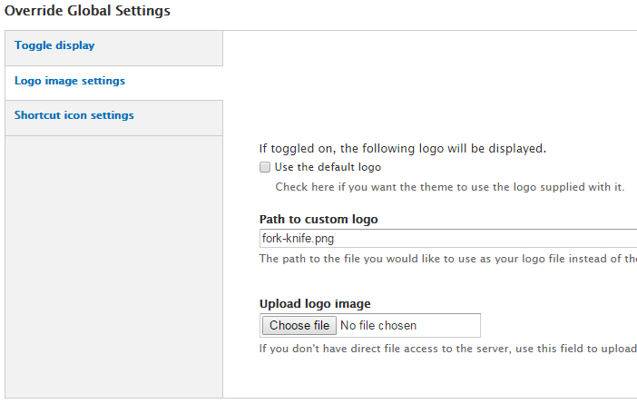
1. Go to admin / appearance / settings / masterchef (replace “masterchef” with the machine-readable name of your Bootstrap subtheme) and then click the Logo image settings link in the Override Global Settings section.
2. Because you do not want to use the default logo, uncheck the Use the default logo checkbox and then use the form to upload your logo to the server.
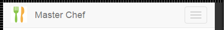
I'm going to upload a png image that’s 32 pixels height by 32 pixels width.
This is how the new logo looks:
Adding new links
Now that the Logo is in place, let’s add several links to the navigation menu.
1. Go to admin / structure / menu / manage / main-menu and then click the Add link link to add a new link to the Main Menu.
2. Fill out the form taking into account that the Main Menu value must be selected in the Parent Link drop-down menu. I have created five new links: Books, Blog, About, Contact, and Log in.
Since no content has been created yet, I have used dummy paths with the links to the Main Menu (with the exception of the Log in link). This link (user / login) will be automatically hidden from the Main Menu after the user logs into the system.

Click on the previous figure to open a modal window with an image of the whole form.
3. Go to admin / structure / menu / manage / user-menu and then click the Add link link to add a new link to the User Menu. Fill out the form like this and click the Save button:
- Menu link title: User Menu
- Path: user
- Description: Enter here the description you like the most for your link
- Enabled checkbox: checked
- Show as expanded checkbox: checked
- Parent link: <User Menu>
- Weight: -10
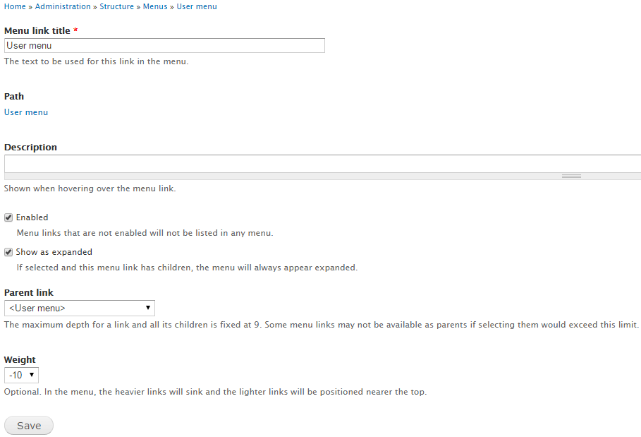
Click on the previous figure to open a modal window with an image of the whole form.
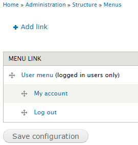
4. Go to admin / structure / menu / manage / user-menu and then rearrange the links like this (don't forget to click the Save configuration button):
- User Menu (logged in users only)
- My account
- Log out
5. Open the Home page in your favourite browser and check out the navigation menu. If everything is OK, it should look like this:
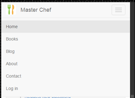
The Log in link is shown because the user hasn't logged into the system yet.
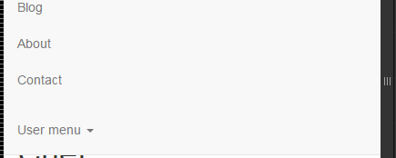
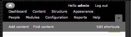
If the user logs into the system, the navigation menu shows the links to the User Menu and hides the Log in link:
Making the navigation menu fluid and sticky
Now let’s make the navigation menu fluid and sticky, meaning that it will take up the whole width of the browser window (also known as viewport) and be placed fixed at the top of the page.
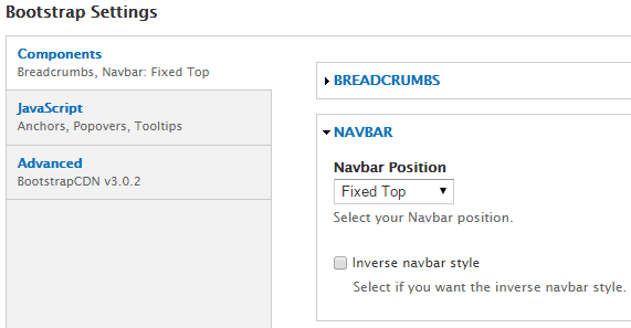
1. Go to admin / appearance / settings / (machine name of your theme) and then click the NAVBAR link in the Bootstrap Settings section.
2. Select Fixed Top from the Navbar Position drop-down menu and then click the Save configuration button.
Making the mobile navigation menu look good
Now that the navigation menu is finished, let’s make it look good by creating some custom CSS styles.
Let’s start with the CSS selectors for extra-small and small screens.
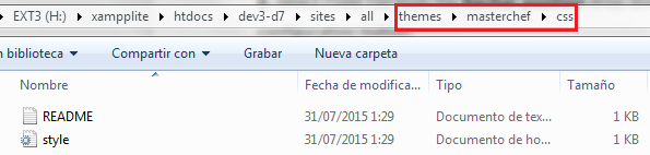
Edit the style.css file to add your custom CSS styles. This file is located in the CSS folder of your Bootstrap subtheme.
1. The logo’s padding-right property has a default value of 15 px. Replace 15px with 5px:
.navbar .logo {
  padding-right: 5px
}
2. The site name’s color property has a default value of #777. Replace #777 with #000000 (black):
.navbar-default .navbar-brand {
  color: #000000
}
3. The header tag’s background-color property has a default value of #f8f8f8. Replace #f8f8f8 with #ffffff (white):
.navbar-default {
  background-color: #ffffff
}
4. The three-line button’s background-color property has a default value of transparent. Replace transparent with #8dc63f.
.navbar-toggle {
  background-color: #8dc63f
}
5. The three-line button’s border-color property has a default value of #ddd. Replace #ddd with #8dc63f.
.navbar-default .navbar-toggle {
  border-color: #8dc63f
}
6. The three lines’ background-color property has a default value of #ccc. Replace #ccc with #ffffff (white):
.navbar-default .navbar-toggle .icon-bar {
  background-color: #ffffff
}
7. When the three-line button is tapped, its background-color property has a default value of #ddd. Replace #ddd with #759549:
.navbar-default .navbar-toggle:hover, .navbar-default .navbar-toggle:focus {
  background-color: #759549
}
If everything is OK, this is how the three-line button should look when the navigation menu for extra-small and small screens is closed:

And this is how it should look when the navigation menu is open:
8. Add the background-color property to the div tag that contains the navigation menu and set its value to #f8f8f8:
.navbar-default .navbar-collapse, .navbar-default .navbar-form {
  background-color: #f8f8f8;
}
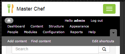
If everything is OK, this is how the navigation menu should look:

Although the mobile navigation menu looks pretty good, there is still one more step to finish it. Please, look carefully at the following image:
9. As you can see in the previous figure, there is an issue with the administrative navigation bar: when an administrator user logs into the system, it is shown over the mobile navigation bar. Since the height of the administrative bar varies depending on the viewport (the width of the browser window), you cannot calculate the value to be set to the header tag’s top property, which contains the mobile navigation bar. How can you solve this issue? Well, what about if you put the administrative bar below the mobile navigation bar, like this:
body.toolbar-drawer .navbar-fixed-top {
  top: 0;
  z-index: 10000;
}

#toolbar {
  top: 51px;
}
Viewport (414 px)
Don't worry about the mobile navigation menu, as it is shown over the administrative bar when you tap the three-line button.