Bootstrap Theming - Making a Custom Block (Part 2/2)
In this part, you are going to finish the custom block by creating some css styles to make it look good.
Making the new block look good
Now that the HTML structure is finished, let's make the new block look like that in the previous sketch.
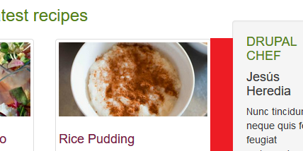
Extra small devices (<768px) Phones (x-small.css)
1. The gap between the recipes grid and the new block is very small. Make it a little bigger.
/** CLIENT BLOCK (FRONT PAGE - SECONDARY REGION) **/
.region-sidebar-second {
  margin-top: 60px
}
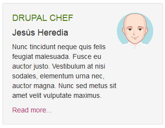
2. Make the picture round.
.client-block img {
  border-radius: 50%
}
In order for the border-radius property to work properly, both the height and width of the picture must be the same.
3. Make the DRUPAL CHEF part of the heading display above your client's name. In addition, set its color and margin-bottom properties to #538114 and 10px respectively.
.client-block h4 span {
  color: #538114;
  display: block;
  margin-bottom: 10px
}
4. Increase a little bit the value of the margin-bottom property of the h4 heading. In addition, change the color of the Read more link to #B73471.
.client-block .media-heading {
  margin: 0 0 10px
}
.client-block a {
  color: #B73A71
}
Small devices (≥768px) Tablets (small.css)
1. The gap between the client block and the recipes grid is the same as the horizontal gap among all recipes. Make it a little bigger.
/** CLIENT BLOCK (FRONT PAGE - SECONDARY REGION) **/
.region-sidebar-second {
   margin-left: 15px
}
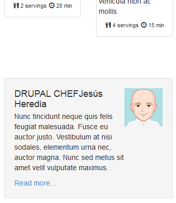
2. The client block is not line up with the title of the recipes grid. Take it up until its top border matches the red line you can see in the following figure:
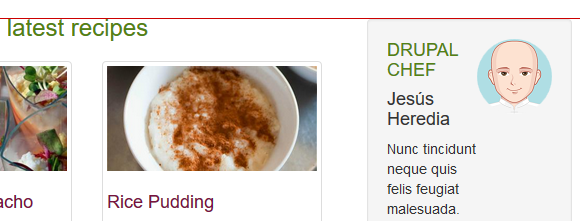
/** CLIENT BLOCK (FRONT PAGE - SECONDARY REGION) **/
.region-sidebar-second {
  margin-left: 15px;
  margin-top: 44px
}
If you look at the client block in the previous figure, you will realize that the width of the p element is quite small when the value of the browser width is between 768px and 991px. This is because the picture is floating in the block and it prevents the paragraph from spanning its whole width. The fix is quite easy: first, set the value of the float property of the pull-right class to none and then centre both the picture and name of your client, like this:
.client-block .pull-right {
  float: none !important;
}
.client-block img {
  margin: 0 auto 10px
}
.client-block .media-heading {
  text-align: center
}
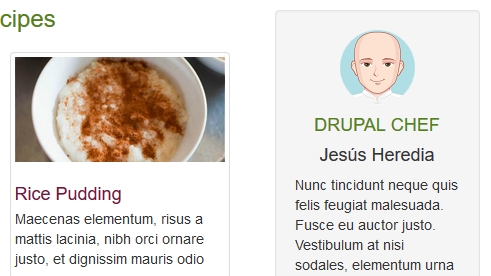
Medium devices (≥992px) Desktops (medium.css)
From this viewport forward, there is plenty of room in order for the paragraph to look good, so that what you must do is to override the rules you have just created, like this:
/** CLIENT BLOCK (FRONT PAGE - SECONDARY REGION) **/
.client-block .pull-right {
  float: right !important
}
.client-block img {
  margin: 0
}
.client-block .media-heading {
  text-align: left
}
Done!