Bootstrap Theming - Making a Custom Block (Part 1/2)

In this article, you are going to make a custom block for displaying a brief description of your client.
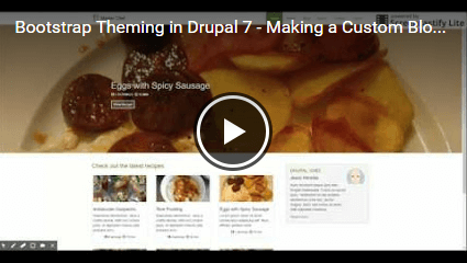
Demonstration video
Please, click on the image below to open a modal window with a video showing the end result of this article.
Download the source code
Please, click here to download the source code you will be working with.
Getting started
Let's get started by creating the HTML structure for the secondary region, which is where you will place the new block.
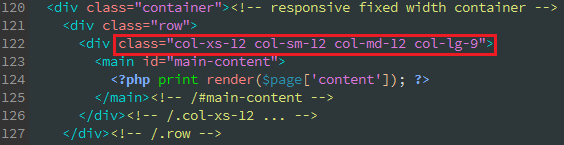
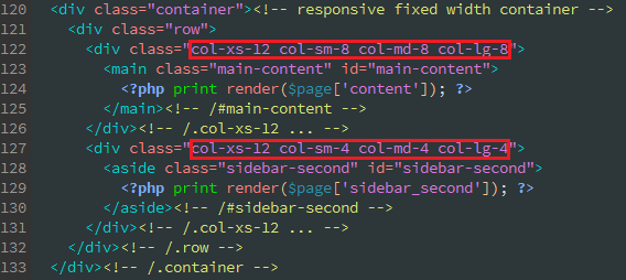
Since you want the secondary region to be displayed to the right of the recipes grid for viewports that are equal or greater than 768px, the Bootstrap classes on line 122 in page--front.tpl.php must be modified. Don’t worry about this now, just take it into account.
1. Open the page--front.tpl.php file in your favourite text editor or IDE. Next, place the cursor at the end of line 126 and then press enter to create a new line.
2. Copy the following piece of code and paste it on line 127 in the previous file.
<div class="col-xs-12">
  <aside class="sidebar-second" id="sidebar-second">
    <?php print render($page['sidebar_second']); ?>
  </aside><!-- /#sidebar-second -->
</div><!-- /.col-xs-12 ... -->
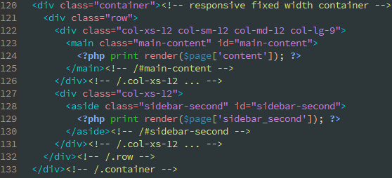
3. Save all changes to the file.
As with line 122, there is just one bootstrap class on line 127 at the moment. Later on, when you learn what the the golden ratio or divine proportion is, you will go back over these lines.
Creating a block
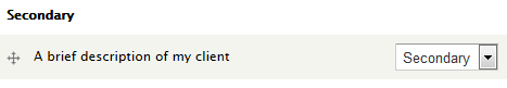
1. To add a new block, go to admin / structure / block / add and fill out the form like this:
- Block Title: leave it blank
- Block Description: A brief description of my client
- Block body: Enter a piece of dummy text (Lorem ipsum dolor sit amet…)
- Text format: Full HTML
- REGION SETTINGS:
- Master Chef (default theme): Secondary
- Ignore the other region settings
- Visibility settings
- Pages - Show block on specific pages: Only the listed pages (<front>)
- Ignore the other visibility settings
2. Click on the Save block button to save the new block.
Determining the right bootstrap classes for the Content and Secondary regions
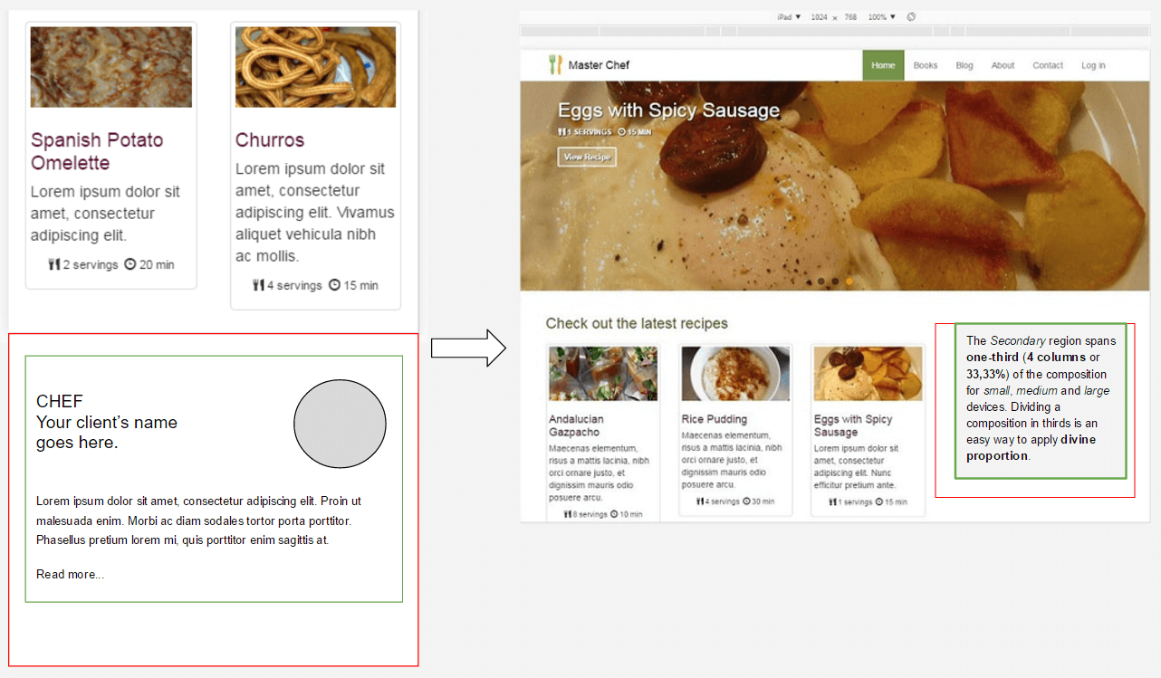
As stated above, you want the Secondary region to be displayed to the right of the recipes grid for viewports that are equal or greater than 768px. In order to do so, first you must determine how many columns will be used with both regions for all those viewports.
Click the previous figure to make it larger.
Here is when the golden ratio or divine proportion comes into play. Let's talk a little about it before continuing.
Using a grid is more than just to line up the elements on the page: it is also a matter of proportion. This concept of dividing the elements of a composition is not new at all. Pythagoras and his followers, the Pythagoreans, observed a mathematical pattern that occurred so often in nature that they believed it was something divine. That's why they called it divine proportion or golden ratio (they defined numbers as ratios rather than single units).
The basic idea is that a line can be divided into two parts using the golden ratio by dividing its size by 1.62 (1.6180339...). If you apply this ratio to your layout, then it will look aesthetically pleasing.
Because the bootstrap grid is divided into 12 columns, if you apply the golden ratio to it, you will get around 8 columns (two-thirds) for the content region and 4 columns for the secondary region (one-third).
Now, let's go back over lines 122 and 127 in page--front.tpl.php to apply the right bootstrap classes.
Customizing the content of the new block
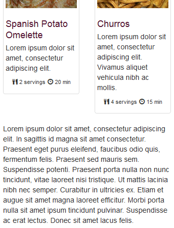
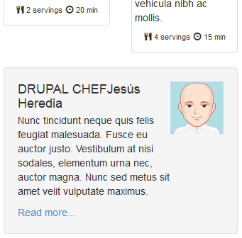
Now, if you preview the new block in your web browser, it should look like this for extra small viewports (<768px)
What you are going to do from now on is to replace the previous Lorem ipsum chunk with the HTML structure needed to add the various elements you can see in the above sketch (a picture, a title, a description, and a Read more link). In order to do so, you are going to make use of the Media Object component. Let's begin!
1. Go back to admin / structure / block / manage / block / 1 / configure and then remove the Lorem ipsum chunk from the block body textarea.
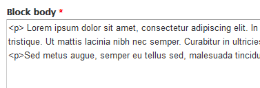
2. Copy the following piece of code and paste it in the block body textarea.
<div class="media">
  <div class="well">
    <div class="pull-right">
      <a href="#"><img class="media-object" src="..." alt="placeholder image"></a>
    </div>
    <div class="media-body">
      <h4 class="media-heading">Media heading</h4>
        <p>Nunc tincidunt neque quis felis feugiat malesuada. Fusce eu auctor justo. Vestibulum at nisi sodales, elementum urna nec, auctor magna. Nunc sed metus sit amet velit vulputate maximus.</p><p><a href="#">Read more...</a></p>
    </div>
  </div>
</div>

The media object component gives you abstract object styles for building various types of components (like blog comments, tweets, etc) that feature a left- or right-aligned image alongside textual content
The classes pull-left and pull-right are deprecated as of Bootstrap v3.3.0. Instead, use media-left and media-right taking into account that media-right should be placed after the media-body in the HTML.
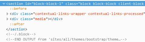
3. Click on the Save block button. If everything is OK, this is what the new block should look like:
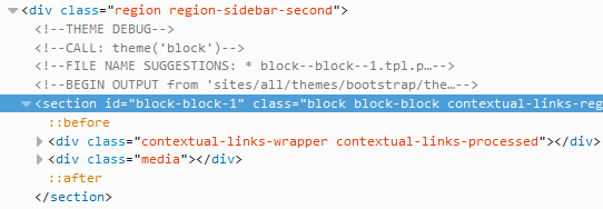
4. If you inspect the HTML code for this block, you will see that it does not provide a meaningful class you can use to apply it some styles. Because it is a good practice to use meaningful classes, install the Block Class module and create a new class named client-block for this block.
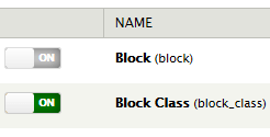
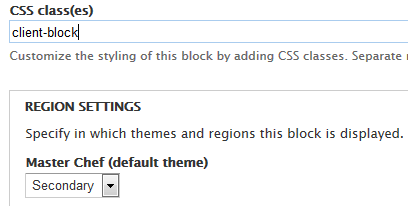
5. Check that the new class has been properly added to the block.