Bootstrap Theming - How to make a fat footer (Part 2/2)

In this part, you are going to create some style rules to make the fat footer look good.
Making the fat footer look good
Let's begin by creating the style rules to make the fat footer container look good.
Extra small devices (<768px) Phones (x-small.css)
1. The gap between the secondary region and the fat footer is small. Make it a little bigger.
/** CLIENT BLOCK (FRONT PAGE - SECONDARY REGION) **/
.region-sidebar-second {
  margin: 60px 0
}
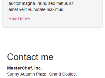
2. Change the background color of the fat footer region to a value of #333333 (dark gray). Likewise, set its color and padding-top properties to a value of #DCDCDC (gainsboro) and 30px respectively.
/** FAT FOOTER (EXTRA FOOTER AND FOOTER REGIONS) **/
.fat-footer {
  background-color: #333333;
  color: #DCDCDC; /* Gainsboro */
  padding-top: 30px
}

3. Change the color of the h2 elements to white. In addition, make them look bold, smaller, and in uppercase letters.
/** FAT FOOTER (EXTRA FOOTER AND FOOTER REGIONS) **/
.fat-footer h2 {
  color: #FFFFFF;
  font-size: 16px;
  font-weight: bold;
  text-transform: uppercase
}
4. Change the color of the a elements to #B73A71 (light green).

5. Remove the bullets from the list of months in the Archives section. In addition, set the padding-left property of the list to a value of 0.
/** FAT FOOTER (EXTRA FOOTER AND FOOTER REGIONS) **/
.fat-footer ul {
  list-style-type: none;
  padding-left: 0
}

6. Place one chevron-right glyphicon next to each link of the list of months.
<ul>
  <li><span class="glyphicon glyphicon-chevron-right" aria-hidden="true"></span> <a href="#">April 2016</a></li>
  <li><span class="glyphicon glyphicon-chevron-right" aria-hidden="true"></span> <a href="#">May 2016</a></li>
  <li><span class="glyphicon glyphicon-chevron-right" aria-hidden="true"></span> <a href="#">June 2016</a></li>
  <li><span class="glyphicon glyphicon-chevron-right" aria-hidden="true"></span> <a href="#">July 2016</a></li>
  <li><span class="glyphicon glyphicon-chevron-right" aria-hidden="true"></span> <a href="#">August 2016</a></li>
</ul>


7. As you can see in the previous image, the chevron-right glyphicon looks a little big. Make it a little smaller and change its color to white.
/** FAT FOOTER (EXTRA FOOTER AND FOOTER REGIONS) **/
.fat-footer .glyphicon-chevron-right {
  color: white;
  font-size: 12px;
  top: 0
}
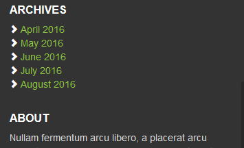
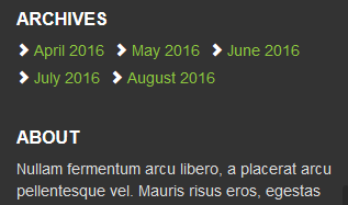
8. In order to make a better use of the available space in the Archives section, make the list items display next to each other with a little gap among them.
/** FAT FOOTER (EXTRA FOOTER AND FOOTER REGIONS) **/
.fat-footer li {
  display: inline-block;
  padding: 0 5px 5px 0
}
9. If you like, make the list items look like buttons.
.fat-footer li {
  border: 1px solid #DCDCDC;
  border-radius: 2px;
  display: inline-block;
  margin: 0 10px 15px 0
}
.fat-footer li a {
  display: block;
  padding: 5px;
  text-align: center
}
.fat-footer li a:hover {
  color: #FFFFFF;
  text-decoration: none
}
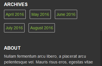
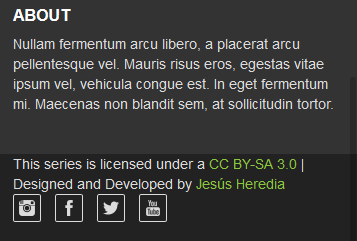
10. There is no room between the About block and the Footer region. Make a little room between them.
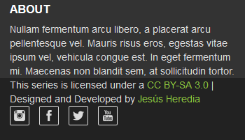
.about-block {
  margin-bottom: 40px
}
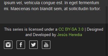
11. By default, the content of the Copyright region is left aligned. Make it center aligned and decrease a little bit its font size. In addition, make a little room above and below it.
.copyright-block {
  font-size: 13px;
  margin-bottom: 10px;
  padding-top: 10px;
  text-align: center
}
12. As you can see in the previous image, the social buttons are left aligned and have a 1-pixel border around them. Make them center aligned, remove their borders, and set the margin-bottom property of the list items to 0.
.social-block {
  text-align: center
}
.social-block li {
  border: none;
  margin-bottom: 0
}
.social-block li a {
  padding: 0 5px 0 0
}

Small devices (≥768px) Tablets (small.css)
1. The titles of the Archives and About blocks are not aligned with the title of the Contact me block. Take them up until they match the red line you can see in the following image:

.archives-block h2,
.about-block h2 {
  margin-top: 0
}

2. Make the content of the Copyright region left aligned and set its margin-bottom property to 10px. In addition, set the min-height property of the standard footer to a value of 40px.
.standard-footer {
  min-height: 40px
}
.copyright-block {
  margin-bottom: 10px;
  text-align: left
}
3. Make the list of social buttons right aligned. In addition, make it center aligned in the Y axis.
.social-block {
  text-align: right
}
.social-block ul {
  margin-bottom: 0
}
.social-block li {
  padding-top: 12px
}

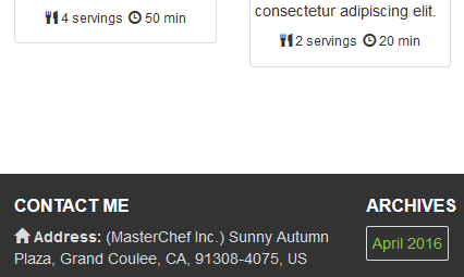
4. Finally, the gap between the grid of recipes and the fat footer is very small. Make it bigger and set the padding-top property of the fat footer to a value of 20px.
.fat-footer {
  margin-top: 60px;
  padding-top: 20px
}
Done!