Bootstrap Theming - Making a Responsive Grid in Drupal 7 (Part 2/4)

In this part, you are going to continue building the responsive grid that you began making in the first part of this article.
6. If you inspect the HTML code now, you will see that the div element used by the Latest Recipes view does not have the class required by Bootstrap to use its grid system: the row class.
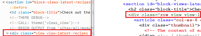
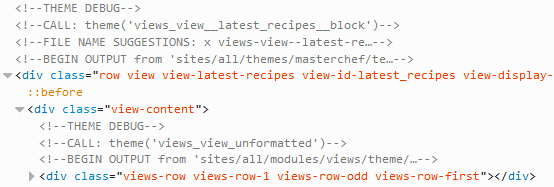
7. In order to add the row class to the div element of the Latest Recipes view, first you must find a template file suggestion. Unfortunately, as you can see in the previous figure, the theme debug mode is unable to give you a template file suggestion, so that you must go back to the Latest Recipes view and then click the Information link in the Other region of the Advanced section (just as you did with the Recipe Slideshow view in the previous article).
8. The right template to be edited for adding the row class to the Latest Recipes view is provided by the first element of the list. Create a new file named views-view--latest-recipes--block.tpl.php in the templates directory of your Bootstrap subtheme and then copy all the content of the views-view.tpl.php file located at sites / all / modules / views / theme into it.
Although the word views does not show up in the previous figure, remember that the right template is views-view--latest-recipes--block.tpl.php.
9. Go to line 30 and add the row class to the div element. Save all changes to the file and clear all caches.
Leave a blank space between the word row and the PHP opening tag.
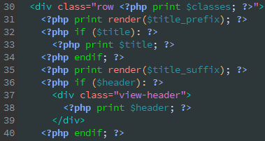
Now the row class is present in the HTML code of the Latest Recipes view.
There is another way to add CSS classes to the display output of a view: just click the CSS class link in the Other region of the Advanced section of your view. If you opt for this way, you can omit steps 7 through 9 (Hey, why you didn't say it before!).
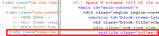
10. Let's carry on with the rows of the Latest Recipes. As you can see in the previous figure, each row of the view is assigned a div element. What you are going to do now is to replace that element with a semantic article tag.
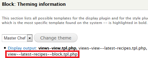
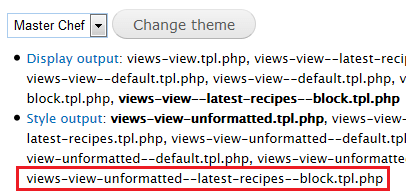
11. Go back to the Latest Recipes view and click again the Information link in the Other region of the Advanced section.
12. The right template to be edited for performing that replacement is provided by the second element of the list. Create a new file named views-view-unformatted--latest-recipes--block.tpl.php in the templates directory of your Bootstrap subtheme and then copy all the content of the views-view-unformatted.tpl.php file located at sites / all / modules / views / theme into it.
13. This is how the piece of code for the rows of the view should look:
<?php

/**
 * @file
 * Default simple view template to display a list of rows.
 *
 * @ingroup views_templates
 */
?>
<?php if (!empty($title)): ?>
  <h3><?php print $title; ?></h3>
<?php endif; ?>
<?php foreach ($rows as $id => $row): ?>
  <article<?php if ($classes_array[$id]) { print ' class="col-xs-6 col-sm-6 col-md-4 col-lg-4 ' . $classes_array[$id] .'"';  } ?>>
    <div class="thumbnail">
      <?php print $row; ?>
    </div>
  </article>
<?php endforeach; ?>
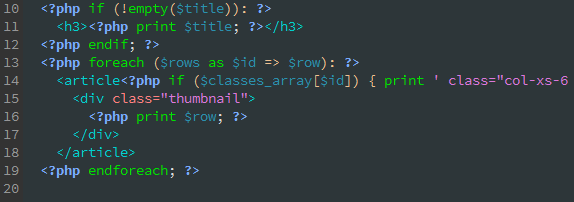
As you can see in the previous figure, both the article tag and the Bootstrap classes have been added to the file at line 14 (col-xs-6, col-sm-6, col-md-4, and col-lg-4 are responsible for setting the width of every article element of the Latest Recipes view). In addition, note that a new div element with a class value of thumbnail has been added at line 15. Thumbnail is a component that extends the Bootstrap grid system to easily display grids of images, videos, text, and more.
When adding the Bootstrap classes at line 14, note that you must leave a blank space between the col-lg-4 class and the closing single quotation mark of the print constructor.

Do not forget to save all changes to the file and clear all caches.
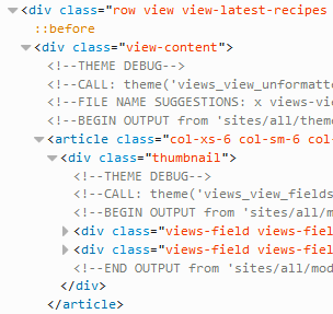
14. Now the article tag is present along with the Bootstrap classes in the HTML code of the Latest Recipes view.
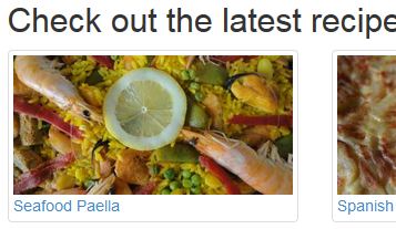
15. If you check out the grid of recipes, you will soon realize that there is a problem with the main image field.
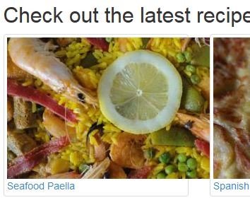
As you can see in the previous figure, the size of the main image field does not fit the width of its container. There are two ways to solve this problem. Either you add the img-responsive class to each image of the grid or you create a CSS rule to make each image of the view responsive (width:100%;height:auto). I’m going to opt for the second way.
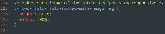
Don’t worry now about the CSS code. You will see it in detail in the fourth part of this article.
After adding the previous piece of code to the style.css file, the images of the Latest Recipes view should look like this: