How to create a slide in box effect by using CSS3 transitions
In this article we'll be covering how to create a slide in box effect with the help of CSS3 transitions. Every time you hover the mouse pointer over any dish name, a box containing the dish description will slide in over its image. In this way we get both, an amazing effect and a very helpful way to describe products and services.
See a demo right now
If you want to see right now the final result of this article, please click on see a demo.
Brief introduction
In the early years of the World Wide Web, web designers used to use just three HTML elements to describe products or services (an image, a heading and a paragraph). That was all they needed to be done.
Today's web designers need something much more powerful than that; something that not only improve the look and feel of web pages, but also has the power of making information available in a surprising manner and the ability to help Search Engines to fully understand the Document Object Model.
Such a power is brought to us by CSS3 and HTML5. Unfortunately, there are some downsides that you should consider before proceeding:
- Although the current versions of all major browsers support CSS3 transitions, Internet Explorer 8.0 and 9.0 does not support them. In addition, the -webkit prefix is required for Safari 5.1, 6.0 and 6.1 (iOS Safari). Link to caniuse.com.
- It’s not a good idea to use a slide in box effect if the area over which the box slides in is too small: There won't be enough room to contain the description! This usually happens when using small images or responsive images with extra-small or small viewports (the browser window width).
Getting started
Let's get started with the following piece of code, that is the basis on which we'll be working. By the way, this code is using all the power that Bootstrap, the front-end framework, gives us:
<!DOCTYPE html>
<html lang="en">
<head>
<!-- saved from url=(0014)about:internet -->
<meta charset="utf-8" />
<title>CSS3 Transitions - Slide in box effect</title>
<meta name="viewport" content="width=device-width, initial-scale=1.0" />
<!-- Bootstrap -->
<link rel="stylesheet" href="https://maxcdn.bootstrapcdn.com/bootstrap/3.3.6/css/bootstrap.min.css" integrity="sha384-1q8mTJOASx8j1Au+a5WDVnPi2lkFfwwEAa8hDDdjZlpLegxhjVME1fgjWPGmkzs7" crossorigin="anonymous">
<style type="text/css">
</style>
<!-- jQuery (necessary for Bootstrap's JavaScript plugins) -->
<script src="https://code.jquery.com/jquery.js"></script>
<!-- Latest compiled and minified JavaScript -->
<script src="https://maxcdn.bootstrapcdn.com/bootstrap/3.3.6/js/bootstrap.min.js" integrity="sha384-0mSbJDEHialfmuBBQP6A4Qrprq5OVfW37PRR3j5ELqxss1yVqOtnepnHVP9aJ7xS" crossorigin="anonymous"></script>
<!-- HTML5 Shim and Respond.js IE8 support of HTML5 elements and media queries -->
<!-- WARNING: Respond.js doesn't work if you view the page via file:// -->
<!--[if lt IE 9]>
<script src="https://oss.maxcdn.com/libs/html5shiv/3.7.0/html5shiv.js"></script>
<script src="https://oss.maxcdn.com/libs/respond.js/1.3.0/respond.min.js"></script>
<![endif]-->
</head>

<body>
</body>
</html>
The preceding piece of code is the basic template for our case study and includes all the stuff Bootstrap needs to work properly. If you don’t know how Bootstrap works, you can find all the information about it at getbootstrap.com
As you can see, there isn’t any code between the <style> tag pair. We'll be putting our own styles between that tag pair as we work on our case study. Likewise, there isn't any code between the <body> tag pair either.
The header and jumbotron
Now we're going to go ahead and make the header and jumbotron for our case study. Hey, what is a Jumbotron for? It is for showcasing key content on the site. This is how it looks like:
<body>
  <div class="container">
    <header class="header">
      <h3 class="text-muted">CSS3 Transitions</h3>
    </header>
    <div class="jumbotron">
      <h1>Slide in box effect with CSS3</h1>
      <p class="lead">Every time you hover the mouse pointer over any dish name, a box containing the dish description will slide in over its image.</p>
    </div>
The menu
Let’s carry on with the menu. As you can see on the demonstration page, there aren't many items on our menu. Don’t worry, they are enough for the purpose of this article. The piece of code for both dishes looks like as follows:
<section class="row">
<h2 style="border-bottom: 1px dotted lightgray; margin: 0 20px 40px 20px; text-align: center;">Menu</h2>
<article class="col-md-3 col-md-offset-2 dish">
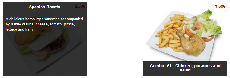
<span>2.50€</span>
<figure>
<img class="img-responsive" src="http://static.jesusheredia.info/images/24/spanish_bocata.jpg" alt="Spanish bocata" />
<figcaption class="dish-details"><h4>Spanish Bocata</h4><p> A delicious hamburger sandwich accompanied by a little of tuna, cheese, tomato, pickle, lettuce and ham.</p></figcaption>
</figure>
</article>
<article class="col-md-3 col-md-offset-2 dish">
<span>3.50€</span>
<figure>
<img class="img-responsive" src="http://static.jesusheredia.info/images/24/pollo_patatas.jpg" alt="Chicken, potatoes and salad" />
<figcaption class="dish-details"><h4>Combo nº1 - Chicken, potatoes and salad</h4><p>A great combination of chicken (drumstick), potatoes and some lettuce with tomato and olives.</p></figcaption>
</figure>
</article>
</section>
</div><!-- end of .container -->
</body>
Doing a magic trick
Once we're done with HTML tags, it's time for the magician to turn up. These are all the rules to do the magic trick:
<style type="text/css">
  .dish {
    border: 1px solid lightgray;
    height: 260px;
    padding: 5px;
    position: relative;
  }

  .dish span {
    display: block;
    color: rgb(204,0,0);
    font-weight: bold;
    float: right;
  }

  .dish-details {
    color: rgb(255,255,255);
    background-color: rgba(0,0,0,0.8);
    font-size: 13px;
    height: 20%;
    padding: 10px 10px 5px 10px;
    position: absolute;
    overflow-y: hidden;
    bottom: 0;
    left: 0;
    width: 100%;
    -webkit-transition: height;
    -webkit-transition-timing-function: ease-in;
    -webkit-transition-duration: 500ms;
    transition: height;
    transition-timing-function: ease-in;
    transition-duration: 500ms;
  }

  .dish-details:hover {
    height: 100%;
  }

  .dish-details h4 {
    font-size: 14px;
    font-weight: bold;
    margin-top: 0;
    margin-bottom: 25px;
    text-align: center;
  }
</style>
In order to fully understand how the transition is made, we must look closely at the following properties:
.dish {
  position: relative;
}
As you can see, every single <article> tag is assigned a class with the name of dish. In order for the slide in box to work properly, it's obligatory to position its container element as a relative position element. Relatively positioned elements are often used as container blocks for absolutely positioned elements.
.dish-details {
  height: 20%;
  position: absolute;
  overflow-y: hidden;
  -webkit-transition: height;
  -webkit-transition-timing-function: ease-in;
  -webkit-transition-duration: 500ms;
  transition: height;
  transition-timing-function: ease-in;
  transition-duration: 500ms;
}

.dish-details:hover {
  height: 100%;
}
First, every <figcaption> tag is assigned an absolute position. An absolute position element is positioned relative to the first parent element that has a position other than static. That's why we positioned the <article> element as a relative position element.
Second, overflow-y: hidden. As you can guess, this property hides the overflow on the Y axis. It's very useful to not fully display the box until the hover event is triggered.
Finally, transition: height. This rule specifies the property to which we want to add an effect. By using all the rules containing the word transition, we instruct the browser to create the slide in box effect. Every time we hover the mouse pointer over any dish name, the browser will increase the box height gradually up to 100%. This transition will take half a second to be done and use an effect called ease-in, which specifies a transition effect with a slow start (equivalent to cubic-bezier(0.42,0,1,1)).