Fluid Images with FancyBox2 under Drupal

Although we talked on Responsive Web Design under Drupal in a previous post, we didn't discuss Fluid Images. Throughout this article, we are going to talk about both Fluid Inline Images and Fluid Images with FancyBox2.
I have already talked about FancyBox2, so if you want to learn about how to add FancyBox2 to Drupal, please click here.
As we said in a previous article about Responsive Web Design, it is of primary importance to place intelligently every single HTML element of a web page - images as well - in order to make a good responsive layout. In this article we shall be talking about a personal approach on Fluid Images for being used not only with Drupal, but also with any web page you wish.
Inline Fluid Images

Although it's easy to make an inline image Responsive or Fluid, there is a handful of Drupal modules you might use to achieve that goal. For instance, you might use a module called 'Responsive Images and Styles' . It's straightforward and you don't get your hands dirty with code. If the weight of the fluid inline image really matters to you and you don't need any of the amazing features FancyBox2 gives you - for example, Responsive Images inside a modal window -, then this module is enough for you.
The point is that you could get both fluid inline images and responsive images inside a modal window without installing any of those modules. A little bit of CSS and FancyBox2, the jQuery plug-in, will be enough for you to get responsive images not only for Drupal but also for any web page. The downside of this approach, as we said above, is that the final weight of that fluid inline image will be the same as the image you upload to the server as there is no script to handle the image size. The upside, in the other hand, is that you can always optimize the weight of an image by using either an image optimization tool - dynamicdrive.com - or a smaller version of the image.
The following piece of code is all you need to make an inline image fluid - just set the <img> tag's max-width property and let the browser handle the height - the web browser will do that for you automatically - :
img {
  max-width: 100%;
}
This fluid inline image with the lake and the swans is 400px width and has a 'max-width' of 50%. This way it will be scaled if its parent wrapper is less than 800px. This image is courtesy of [anankkml] - FreeDigitalPhotos.net.
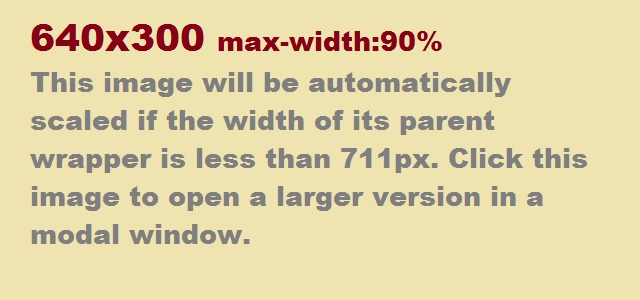
Now imagine that you insert an image of 640 px width in an article and you set the width of its wrapper to 711 px. Since 640 px is the 90% of 711 px, if you make that wrapper smaller, the image will be scaled. If you provide two versions of the same image, then you could be able to use the smaller one in this way and the larger one with FancyBox2. If you want to center the image, you can use the following piece of code:
img {
  display: block;
  margin: 0 auto;
  max-width: 90%;
}

This new image will be scaled if the width of its parent wrapper is less than 711px. Moreover, you can click the image to open a larger version - which is fluid as well - in a modal window provided by FancyBox2.