Flexbox explained (1)
This is the first chapter of the Flexbox explained series. In this chapter, you will learn about the main and cross axis, and how you can align flex items using the following properties: justify-content, align-items, and align-self.
What is Flexbox and why is it so cool to lay out your web sites and apps?
Flexbox is a Layout model (CSS Flexible Box Layout Module). Before you used to work with four different layout models: block, inline, table, and positioned. Now you can work with up to six different layout models: the already mentioned ones plus Flexbox and Grid layout.
Flexbox allows you to layout your web sites and apps more efficiently because it gives the parent container (called flex container) the ability to work with two different axes (for the first time you have a vertical axis, and a horizontal axis). In addition, it also has the ability to alter the size, alignment, and order of its child elements (flex items) to accommodate them as best as possible to the available free space.
I do know that this sounds crazy at first, so let’s begin working with Flexbox step by step, little by little, slowly but surely, in order to get the most out of it.
Getting started (display:flex)
Let’s get started with the following piece of code:
<!DOCTYPE html>
<html lang="en">
<head>
  <meta charset="utf-8" name="viewport" content="width=device-width, user-scalable=no, initial-scale=1.0,
maximum-scale=1.0, minimum-scale=1.0">
  <title>Flexbox explained 1</title>
  <style>
    h1 {
      color: darkblue;
      text-align: center;
    }
    .flex-container {
      width: 800px;
      height: 400px;
      margin: 0 auto;
      background-color: deepskyblue;
    }
    div.flex-item {
      color: white;
      background-color: blueviolet;
    }
    div.flex-item-2 {
      background-color: darkorange;
    }
  </style>
</head>

<body>
  <h1>Flexbox explained 1</h1>
  <div class="flex-container">
    <div class="flex-item flex-item-1">Flexbox 1</div>
    <div class="flex-item flex-item-2">Flexbox 2</div>
  </div>
</body>
</html>
which it is rendered by the web browser like this:
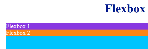
As you can see in the previous image, both boxes are rendered one below the other. Now, what happens if you give the parent container the property:value pair display:flex?
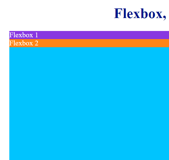
As the following pen shows, both boxes are rendered one next to the other. In addition, they fit the whole height of their parent container:
See the Pen Flexbox, Getting Started (display:flex) by Jesus (@jeshr) on CodePen.
When you give the parent container the property:value pair display:flex, its child elements become flexible boxes. Please, be careful with this. Its child elements become flexible boxes. The parent container remains the same.
In order to understand how the web browser renders the HTML code, it is required that you know how to interpret the following image, which is the foundation of how Flexbox works:
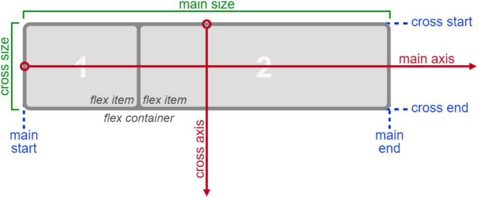
The previous image belongs to the W3C Candidate Recommendation for Flexbox.
As you can see, there are two axes (main axis and cross axis). Flex items will be aligned in the main axis, which is horizontal by default. That’s why the above boxes were rendered one next to the other.
Flex-direction (row | row-reverse | column | column-reverse)
You can instruct the browser to lay out flex items vertically by setting the direction of the flex container’s main axis to column (property:value flex-direction:column). If you change the direction to column, flex items will be rendered one below the other, like this:
The flex-direction is a property of the flex container that can take the following values:
- row(default): left to right in ltr and right to left in rtl.
- row-reverse: same as row, but right to left in ltr and left to right in rtl.
- column: top to bottom.
- column-reverse: same as column, but bottom to top.
If the flex-direction property has a value of row (which is the value by default), the main size property will match the width property of the parent container or flex items (and the cross size property will match their height property). However, if the flex-direction property has a value of column, then the cross size property will match the width property of the parent container or flex items (and the main size property will match their height property).
In addition, flex items are placed into the parent container starting on the main start side and going towards the main end side.
Flex lines are filled with items and placed into the container starting on the cross start side and going towards the cross end side.
I will explain flex lines in detail later on in this series.
See the Pen Flexbox explained 1 (flex-direction) by Jesus (@jeshr) on CodePen.
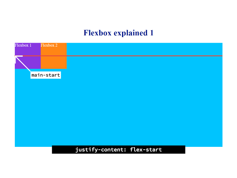
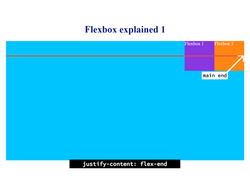
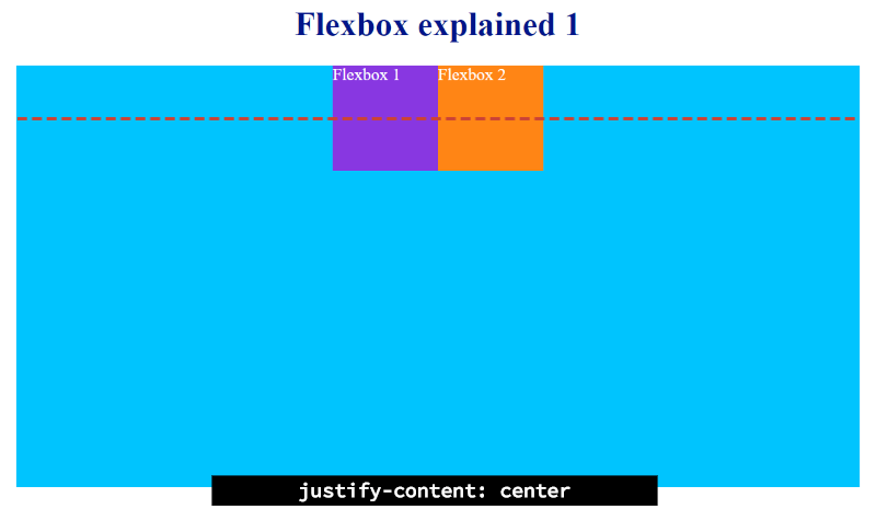
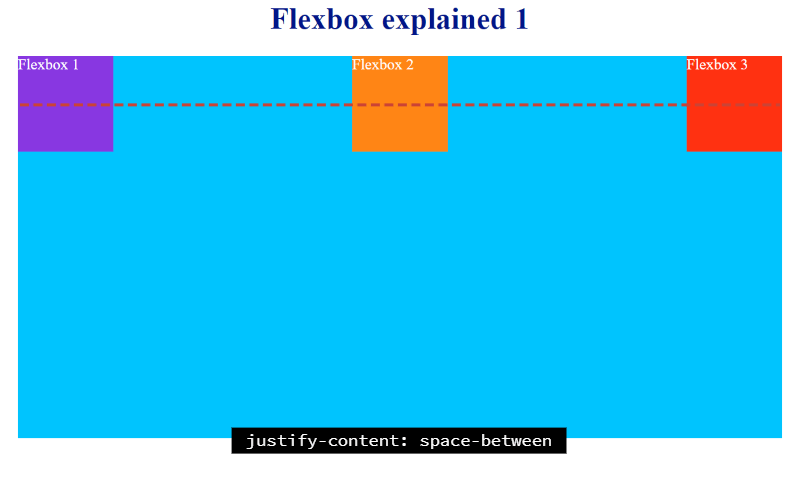
Justify-content (flex-start | flex-end | center | space-between | space-around)
Let’s carry on with another property of the flex container. Flex items can be aligned along the main axis by using the justify-content property.
Justify-content is a property of the flex container that can take the following values:
The following screenshots have been taken with the flex-direction property set to row, which is the value by default. That is, the main axis is horizontal.
-
flex-start (default): flex items are laid out starting on the main start side of the main axis.
-
flex-end: flex items are laid out starting on the main end side of the main axis .
-
center: flex items are centered in the parent container along the main axis.
-
space-between: flex items are evenly laid out in the line. If the leftover free space is negative or there is only a single flex item on the line, then you will get the same result as with the flex-start value. Otherwise, the edge of the main start margin of the first flex item is placed in the same place that the main start edge of the line: the edge of the main end margin of the last flex item is placed in the same place that the main end edge of the line, and the remaining flex items are distributed so that the spacing between any two adjacent items is the same.
-
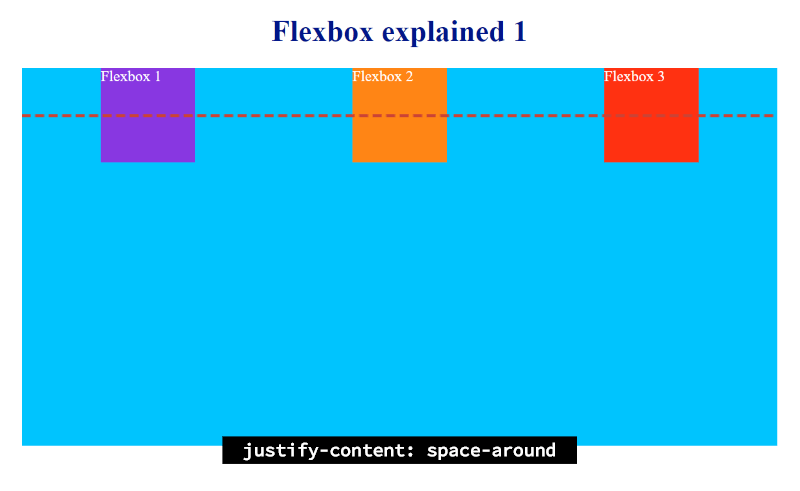
space-around: flex items are evenly laid out in the line in such a way that the spacing between any two adjacent flex items is the same and the spacing between the first/last flex item and the flex container edge is half the size of the spacing between/among flex items. If the leftover free space is negative or there is only a single flex item on the line, then you will get the same result as with the center value.
See the Pen Flexbox explained 1 (justify-content) by Jesus (@jeshr) on CodePen.
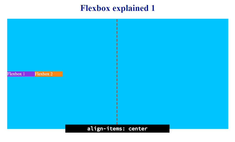
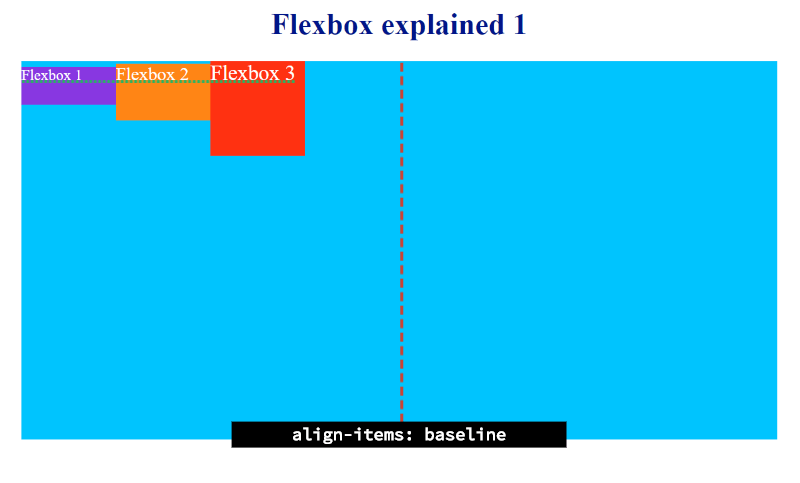
Align-items (stretch | flex-start | flex-end | center | baseline)
Let’s continue with another property of the flex container. Flex items can be aligned in the cross axis by using the align-items property.
Align-items is a property of the flex container that can take the following values:
The following screenshots have been taken with the flex-direction property set to row (the main axis is horizontal), which is the value by default, and the justify-content property set to flex-start, which is also the default value.
-
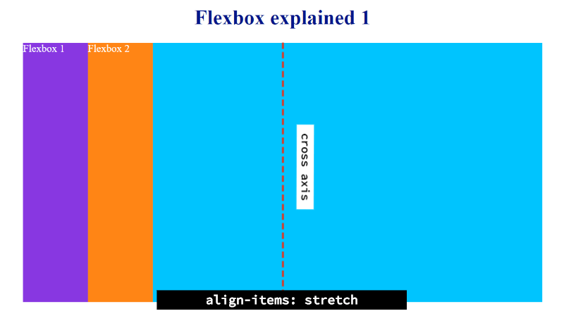
stretch (default): if the cross size property of the flex-item is set to auto and neither of the cross axis’ margins are auto, the flex item is stretched. Its value is set to the length necessary to make the cross size of the item’s margin box as close to the same size as the line as possible. That’s why the above flex elements were rendered fitting the whole height of their flex container.
-
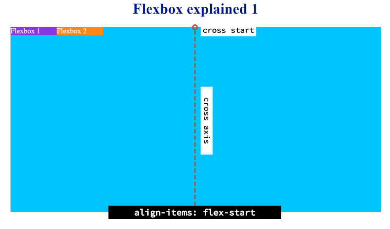
flex-start: the cross start margin edge of the flex item is placed flush with the cross start edge of the line.
-
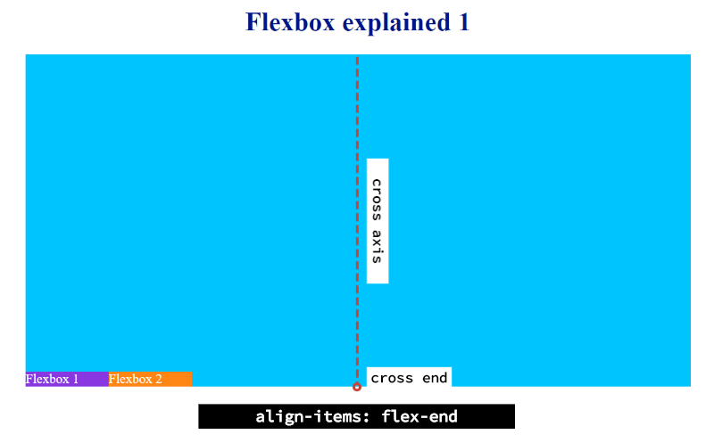
flex-end: the cross end margin edge of the flex item is placed flush with the cross end edge of the line.
-
center: the margin box of the flex item is centered in the cross axis within the line.
-
base-line: the flex item participates in baseline alignment, which means that they are laid out in such a way that their baselines align and the flex item with the largest distance between its baseline and its cross-start margin edge is placed flush with the cross-start edge of the line. If the item does not have a baseline in the necessary axis, then one is synthesized from the flex item’s border box.
See the Pen Flexbox explained 1 (align-items) by Jesus (@jeshr) on CodePen.
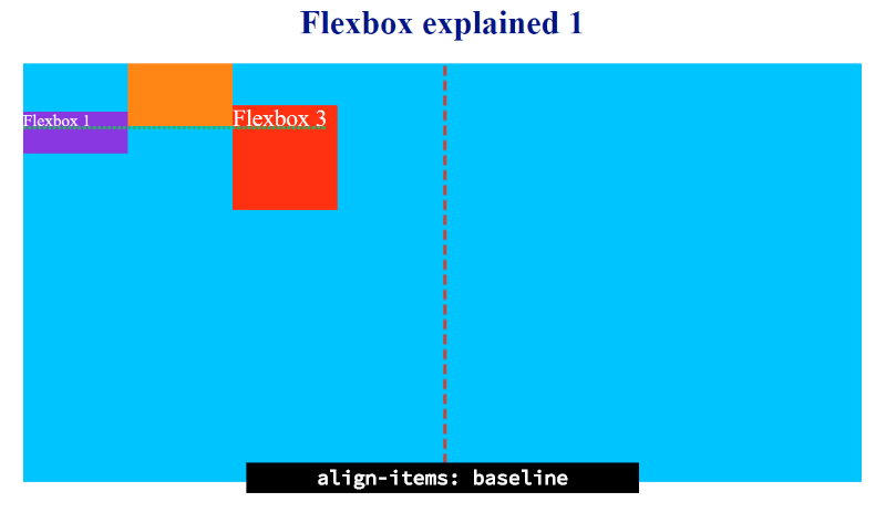
Align-self (stretch | flex-start | flex-end | center | baseline)
Now, if you want to override the default alignment of any of the previous flex items, then you have to use the align-self property, which can take the same properties as the align-items property.
This is a property for flex-items.
For example, let’s override the alignment of the third flex item of the previous figure.
See the Pen Flexbox explained 1 (align-self) by Jesus (@jeshr) on CodePen.
Thank you Martin Woortman on Unsplash for the cover photo.