Bootstrap Theming - Responsive Navigation Menu in Drupal 7 (Part 2/2)

In this article, I'm going to finish the sticky (fixed to top), fluid, and responsive navigation menu in Drupal 7 with Bootstrap.
Getting Started
As you may know, Bootstrap is a mobile-first framework for developing responsive projects on the Web. There are quite a few people (specially among beginners) who mistake ‘mobile-first’ for ‘responsive’. While ‘Responsive / Responsive Web’ is a technique that’s based on CSS media queries for making websites accessible for all types of devices, ‘mobile-first’ is just to take into account mobile devices first and then the rest of devices.
Because you have already taken into account the navigation menu for extra-small and small devices in the first part of this article, now it’s the turn for medium, large, and extra-large devices (768 px and upward).
Making the navigation menu look good for medium and large screens
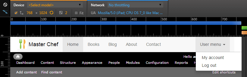
1. Open the Development Tools of your favourite browser and then select a viewport that’s equal to or greater than 768 px. The following screenshot shows how the navigation menu looks on an Ipad (768x1024):
2. The navigation bar’s background-color property has a value of #f8f8f8. Replace #f8f8f8 with #ffffff (white). Now is when CSS media queries come into play:
@media only screen and (min-width: 768px) {
  .navbar-default .navbar-collapse, .navbar-default .navbar-form {
    background-color: #ffffff;
  }
}
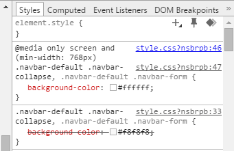
As you can see in the previous figure, the CSS media query is working properly: now the navigation bar’s background-color property is white.
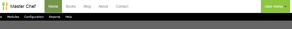
3. The active list item’s background-color property has a value of #e7e7e7. Replace #e7e7e7 with #759549. In addition, its color property has a value of #555. Replace #555 with #ffffff (white).
@media only screen and (min-width: 768px) {
  .navbar-default .navbar-collapse, .navbar-default .navbar-form {
    background-color: #ffffff;
  }

  .navbar-default .navbar-nav>.active>a,
  .navbar-default .navbar-nav>.active>a:hover,
  .navbar-default .navbar-nav>.active>a:focus {
    background-color: #759549;
    color: #ffffff;
  }
}
4. When you hover the mouse pointer over the list items, the a tag’s color property for every list item has a value of #333. Replace #333 with #ffffff. In addition, its background-color property has a value of transparent. Replace transparent with #8dc63f.
@media only screen and (min-width: 768px) {
  .navbar-default .navbar-collapse, .navbar-default .navbar-form {
    background-color: #ffffff;
  }

  .navbar-default .navbar-nav>.active>a,
  .navbar-default .navbar-nav>.active>a:hover,
  .navbar-default .navbar-nav>.active>a:focus {
    background-color: #759549;
    color: #ffffff;
  }

  .navbar-default .navbar-nav>li>a:hover, .navbar-default .navbar-nav>li>a:focus {
    background-color: #8dc63f;
    color: white;
  }
}

5. If you look closely at the previous figure, you will see that there is little space between the site title and the first list item. What about if you add the margin-right property to the site title with a value of, for example, 20px?
@media only screen and (min-width: 768px) {
  .navbar-default .navbar-collapse, .navbar-default .navbar-form {
    background-color: #ffffff;
  }

  .navbar-default .navbar-nav>.active>a,
  .navbar-default .navbar-nav>.active>a:hover,
  .navbar-default .navbar-nav>.active>a:focus {
    background-color: #759549;
    color: #ffffff;
  }

  .navbar-default .navbar-nav>li>a:hover, .navbar-default .navbar-nav>li>a:focus {
    background-color: #8dc63f;
    color: white;
  }

  .navbar>.container .navbar-brand {
    margin-right: 20px;
  }
}

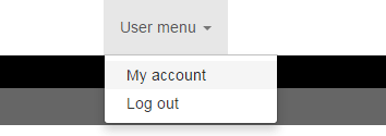
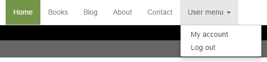
6. When an administrator user logs in, the navigation menu shows the links that belong to the User Menu. If you hover the mouse pointer over it, this is how it looks:
Now, if you click on it, the links that you created in the first part of this article are shown, like this:
7. Lastly, you may want to place the links that belong to the Main Menu near the User Menu, leaving the logo and site title in the left side. In order to do so, you have to float the nav tag to the right, like this:
@media only screen and (min-width: 768px) {
  .navbar-default .navbar-collapse, .navbar-default .navbar-form {
    background-color: #ffffff;
  }

  .navbar-default .navbar-nav>.active>a,
  .navbar-default .navbar-nav>.active>a:hover,
  .navbar-default .navbar-nav>.active>a:focus {
    background-color: #759549;
    color: #ffffff;
  }

  .navbar-default .navbar-nav>li>a:hover, .navbar-default .navbar-nav>li>a:focus {
    background-color: #8dc63f;
    color: white;
  }

  .navbar>.container .navbar-brand {
    margin-right: 20px;
  }

  header nav {
    float: right;
  }
}
Done!