Bootstrap Theming - Making a Responsive Grid in Drupal 7 (Part 4/4)

Finally, in this part you are going to create some CSS rules to make the responsive grid look good.
Download the CSS code
Please, click here to download the CSS code you will be working with.
Making the responsive grid look good
For extra small devices (<768px)
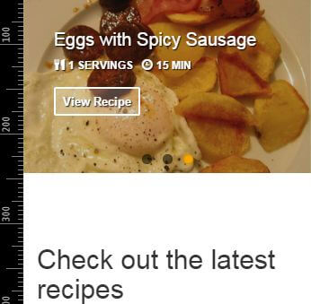
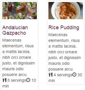
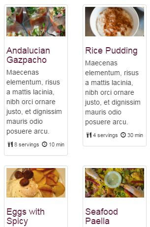
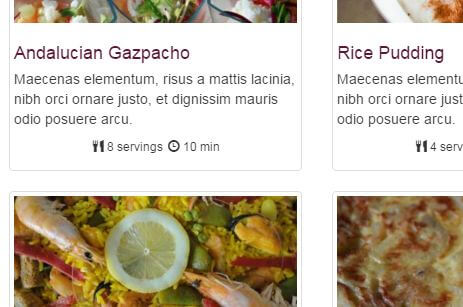
1. The gap between the title of the grid and the slideshow is too large. In addition, the font-size and color properties of the title of the grid are not proper.
.flexslider {
  margin: 0;
}
/* Latest Recipes Grid (Front Page) */
#block-views-latest-recipes-block h2 {
  color: #426118;
  font-size: 24px;
  margin: 40px 0 20px 0;
}
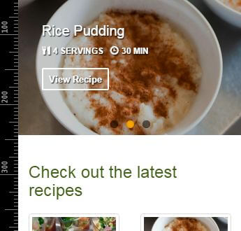
2. The font size of the h3 element of each recipe is too large. Besides, its color and margin-bottom properties are not proper either.
#block-views-latest-recipes-block h3 {
  color: #5A1634;
  font-size: 18px;
  margin-bottom: 5px;
}
3. The servings and time fields are too near the body field. In addition, their font-size and text- align properties are not proper.
.views-field-field-recipe-servings {
  font-size: 11px;
  margin: 10px 0;
  text-align: center;
}
4. As you can see in the previous figure, the clock icon and the word servings are too close each other. Let’s move the clock icon to the right a little bit.
#block-views-latest-recipes-block .recipe-servings-value {
  margin-right: 5px;
}
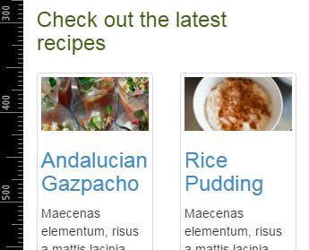
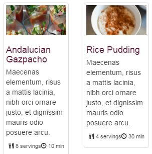
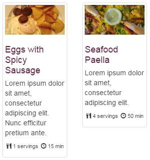
5. As you can see in the following figure, there is a problem with the location of the third recipe of the view.
Because of the height of the first article of the view and given that every article is assigned the float property with a value of left, the third article cannot be placed below the first article.
The solution is quite easy: add the clear property to the third article with a value of left.
The fifth article of the view has the same problem as the third one, so add the same [property:value] to it too.
#block-views-latest-recipes-block .views-row-3,
#block-views-latest-recipes-block .views-row-5 {
  clear: left;
}
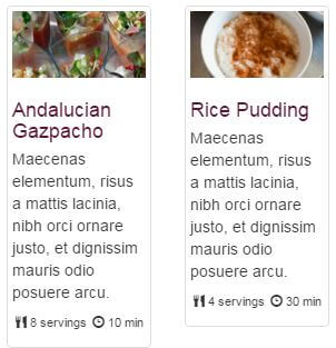
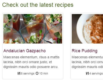
6. If you look closely at the h3 elements of the previous figure, you will realize that the various lines that make up the titles of the recipes are too close each other. This is because the line-height property has a default value of 1.1, which is a small value for an h3 element with a font-size value of 18px. Let’s override the default line-height property for the h3 elements of this view with a value of 1.2
#block-views-latest-recipes-block h3 {
  color: #5A1634;
  font-size: 18px;
  line-height: 1.2;
  margin-bottom: 5px
}
7. Increase a little bit the font size of the servings and time fields for those viewports that are equal or greater than 480px
@media only screen and (min-width: 480px) {
  .views-field-field-recipe-servings {
    font-size: 12px;
  }
}
For medium devices (≥992px)
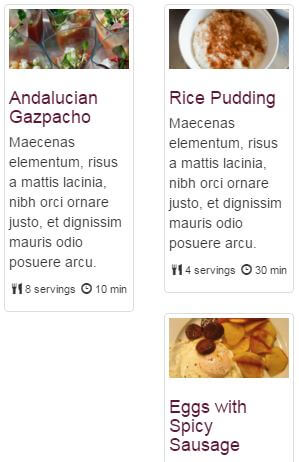
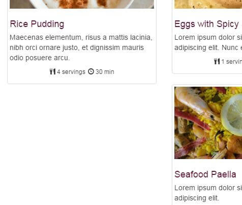
1. Now, you have the same problem of placement with the fourth article of the view.
2. Remove the clear property from the third and fifth element of the view.
@media only screen and (min-width: 992px)  {
  …

  #block-views-latest-recipes-block .views-row-3,
  #block-views-latest-recipes-block .views-row-5 {
    clear: none;
  }
}
3. Add the clear property with a value of left to the fourth element of the view.
@media only screen and (min-width: 992px) {
  …

  #block-views-latest-recipes-block .views-row-3,
  #block-views-latest-recipes-block .views-row-5 {
     clear: none;
  }

  #block-views-latest-recipes-block .views-row-4 {
    clear: left;
  }
}
Done!
These are the authors of the new pictures I have added to the Latest Recipes view. Thank you guys!
"Huevos con Chorizo" or Eggs with spicy sausage
by BocaDorada
License: CC Attribution-ShareAlike 2.0 Generic
No changes were made
"Arroz con Leche" or Rice Pudding
by Lore & Guille
License: CC Attribution 2.0 Generic
No changes were made
"Gazpacho Andaluz" or Andalucian Gazpacho
by Elise Thompson
License: CC Attribution-NonCommercial-NoDerivs 2.0 Generic
No changes were made