Bootstrap Theming - Keeping your CSS code uncluttered

In this article, you are going to use the @import directive to help organize your styles.
So far, you have used just one file (style.css) to store all the CSS code of your Bootstrap subtheme. Also, you have used very few comments to explain what your code does. This is not how you should manage your CSS code, since, when it becomes bigger, it will turn into a real mess.
In this article, you are going to solve that issue by creating multiple files and making use of the @import directive.
Download the CSS code
Please, click here to download the CSS code you will be working with.
Getting started
Let's get started by creating four new files in the css directory of your Bootstrap subtheme.
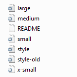
1. Create four empty files named x-small.css, small.css, medium.css, and large.css in the css directory of your Bootstrap subtheme.
Although it is not necessary, it is a good idea that the name of each file matches the viewport its code will be applied to.
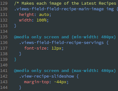
2. Cut all the CSS rules for the extra small devices from the style.css file and paste them into the x-small.css file (lines 5 through 165).
3. Cut the following piece of code from style.css and paste it into the x-small.css file below the code in step 2.
@media only screen and (max-width: 480px) and (orientation: landscape) {
  .view-recipe-slideshow {
    margin-top: -44px;
  }
  .flexslider {
    height: 300px;
  }
}
4. Cut the following piece of code from style.css and paste it into the x-small.css file below the code in step 3.
@media only screen and (max-width: 767px) and (orientation: landscape) {
  .view-recipe-slideshow {
    margin-top: -64px;
  }

  .flexslider {
    height: 100vh;
    overflow: hidden;
  }

  .view-recipe-slideshow .views-field-title {
    top: 35%;
    width: 76vw;
  }

  .view-recipe-slideshow .recipe-title {
    font-size: 24px;
  }
}

5. Save all changes to the x-small.css file.
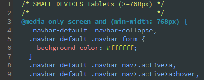
6. Cut the following piece of code from style.css and paste it into the small.css file.
@media only screen and (min-width: 768px) {
  .navbar-default .navbar-collapse, .navbar-default .navbar-form {
    background-color: #ffffff;
  }

  .navbar-default .navbar-nav>.active>a,
  .navbar-default .navbar-nav>.active>a:hover,
  .navbar-default .navbar-nav>.active>a:focus {
    color: #ffffff;
    background-color: #759549;
  }

  .navbar-default .navbar-nav>li>a:hover, .navbar-default .navbar-nav>li>a:focus {
    color: white;
    background-color: #8dc63f;
  }

  .navbar>.container .navbar-brand {
    margin-right: 20px;
  }

  header nav {
    float: right;
  }

  /*.front .navbar {
    border: none;
  }*/

  .flexslider {
    height: 535px;
    overflow: hidden;
  }

  .view-recipe-slideshow .views-field-title {
    top: 35%;
    width: 50vw;
  }

  .view-recipe-slideshow .recipe-title {
    font-size: 28px;
  }
}

@media only screen and (min-width: 768px) and (orientation: portrait) {
  .flexslider {
    height: 480px;
    overflow: hidden;
  }
}
7. Save all changes to the small.css file.
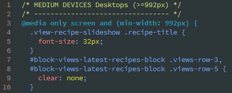
8. Cut the following piece of code from style.css and paste it into the medium.css file.
@media only screen and (min-width: 992px) {
  .view-recipe-slideshow .recipe-title {
    font-size: 32px;
  }

  #block-views-latest-recipes-block .views-row-3,
  #block-views-latest-recipes-block .views-row-5 {
    clear: none;
  }

  #block-views-latest-recipes-block .views-row-4 {
    clear: left;
  }
}
9. Save all changes to the medium.css file.
10. Cut the following piece of code from style.css and paste it into the large.css file.
@media only screen and (min-width: 1200px) {
  .view-recipe-slideshow .views-field-title {
    top: 25%;
    width: 50vw;
  }

  .view-recipe-slideshow .recipe-title {
    font-size: 36px;
  }

  .view-recipe-slideshow .recipe-title,
  .view-recipe-slideshow .recipe-servings,
  .view-recipe-slideshow .recipe-link {
    margin-left: 24%;
  }
}

@media only screen and (min-width: 1600px) {
  .view-recipe-slideshow .views-field-title {
    top: 20%;
  }

  .view-recipe-slideshow .recipe-title,
  .view-recipe-slideshow .recipe-servings,
  .view-recipe-slideshow .recipe-link {
    margin-left: 48%;
  }
}
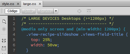
11. Save all changes to the large.css file.
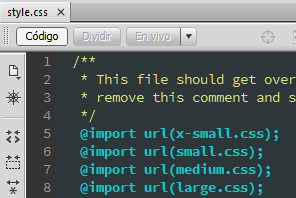
12. Finally, copy the following piece of code and paste it into the style.css file.
 @import url(x-small.css);
 @import url(small.css);
 @import url(medium.css);
 @import url(large.css);
How does the @import directive work?
CSS has a built-in way to add external style sheets: the @import directive. This is how your Bootstrap subtheme adds the style.css file to your site.
What you may not know is that the @import directive can do a thing that the <link> tag cannot: it can attach external style sheets to an external style sheet. This is exactly what you have done in this article to organize your styles: you have attached several external style sheets (x-small.css, small.css, medium.css, and large.css) to an external style sheet (style.css).